EmpowerGenZtravelerstoplanandsplitthecostofactivitieswithfellowbackpackers.
Team
Lillian Wyse.
Poornima Solanki.
Judit Moya.
Myself.
Tools
Figma.
Miro Board.
Visily AI.
Adobe Creative Suite.
Timeline
Problem & Research (3 Months).
Logic & Architecture (3 Months).
Wireframing & Flows (3 Months).
Identity & System (3 Months).
Prototyping & Testing (3 Months).
Roles
Lonely Planet's plan for Gen Z travellers.
Lonely Planet was looking for the ultimate native app designed to be a digital companion piece to Lonely Planet books, apps, and website. The app must seamlessly integrate into the ecosystem, offering creative and user-centric features for both “The Backpacker” and the “Well-Traveled Adventurer” Gen Z audiences. From pre-travel planning, during the journey, to post-travel sharing, the app must facilitate finding accommodation, restaurants, and local sites and fostering connections among users.
The quest to understand Gen Z travel needs.
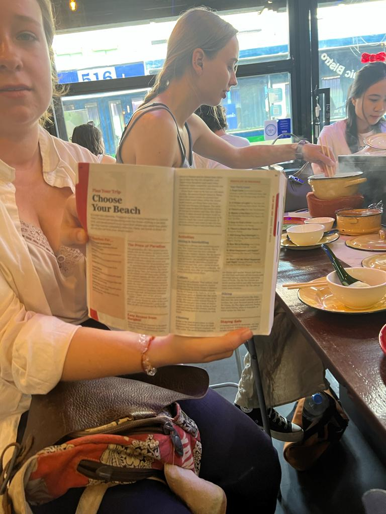
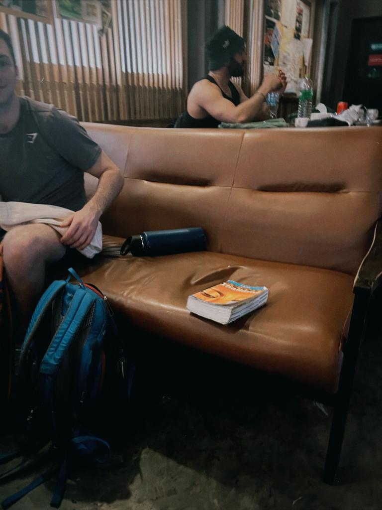
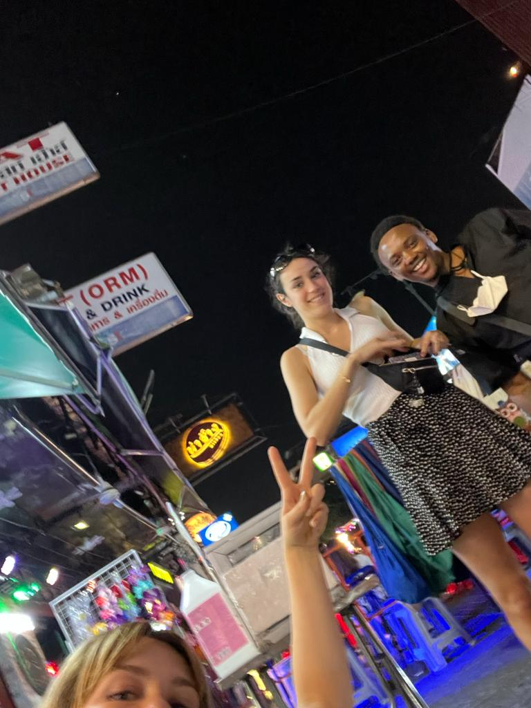
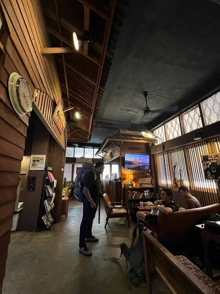
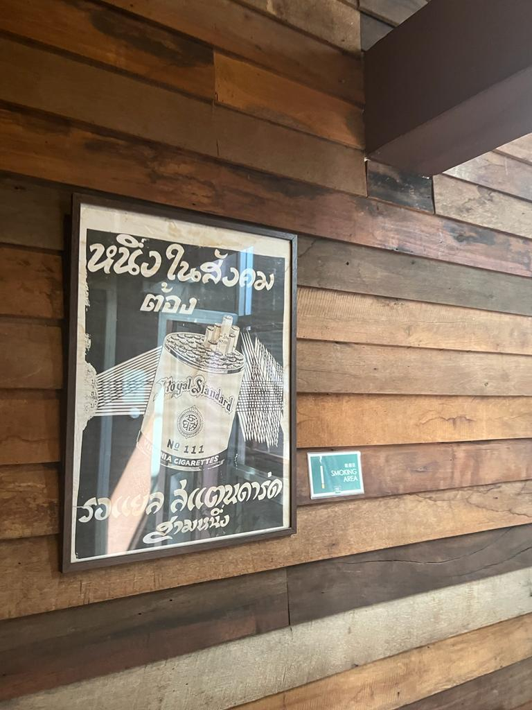
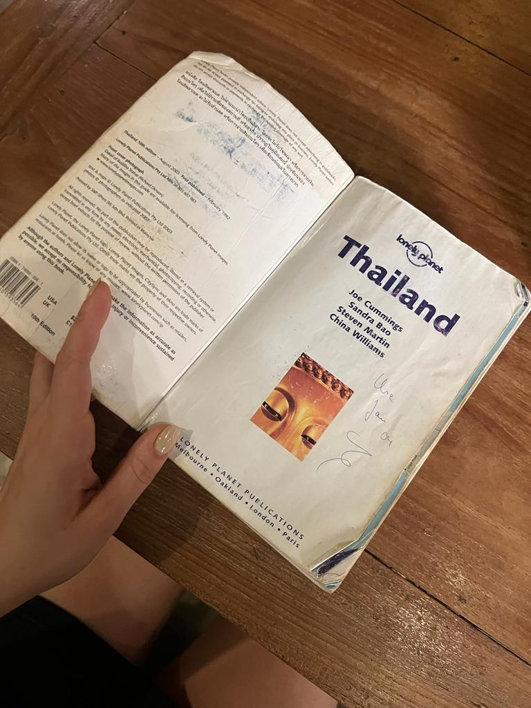
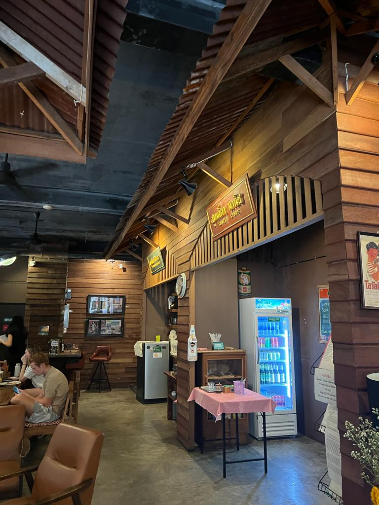
Our team embarked on an extensive research journey to understand the needs and aspirations of our target audiences. We each interviewed 25 travellers. We went to backpacker hostels within Khaosan Road, Bangkok, Thailand, and strategically timed our interactions with backpackers, catching them before they embarked on their adventures in pursuit of affordable dining and vibrant nightlife activities. This approach ensured their receptiveness to our inquiries, free from distractions and fully engaged them.
Moreover, we sought out hostel-friendly restaurants with communal seating, where we engaged in meaningful conversations with travellers, creating a relaxed atmosphere that encouraged open dialogue. This enabled us to enrich our understanding of their unique needs and pain points, grasping the essence of their wanderlust.
We gained valuable insights into the preferences of backpackers and well-travelled adventurers. During brainstorming sessions, we explored various concepts that aligned perfectly with Lonely Planet's brand essence, ensuring our design resonates with their needs.
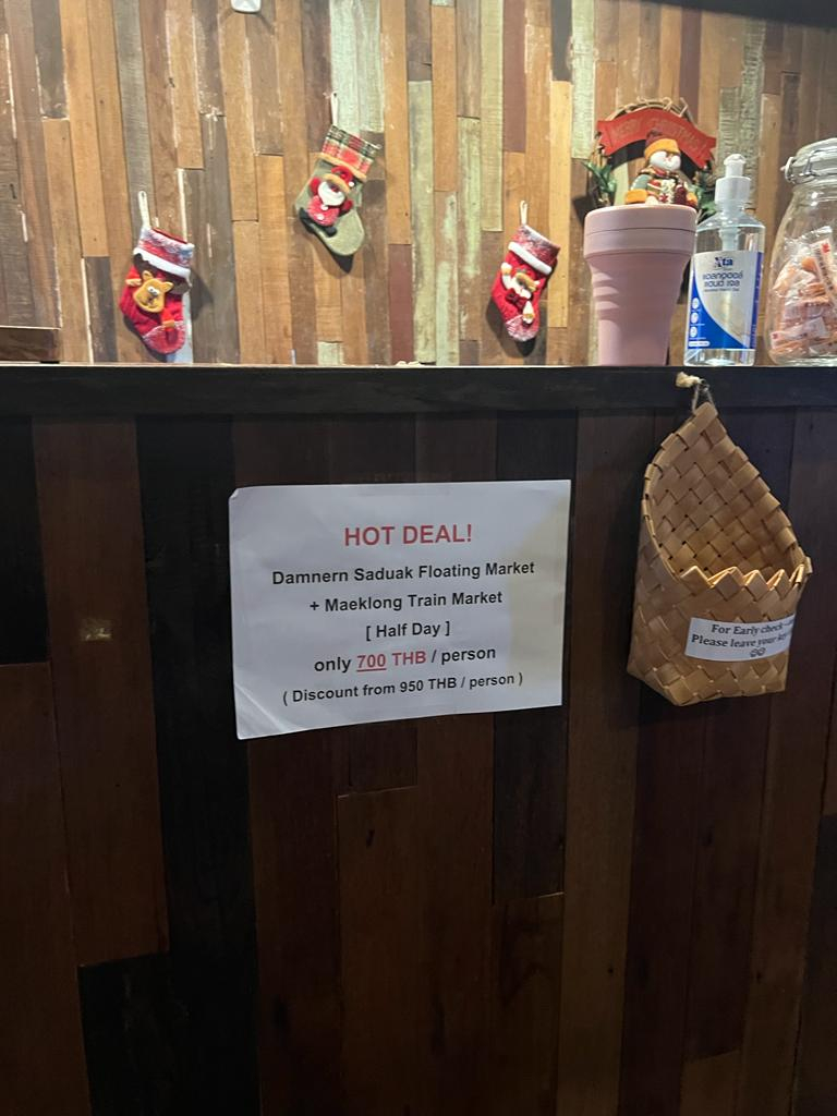
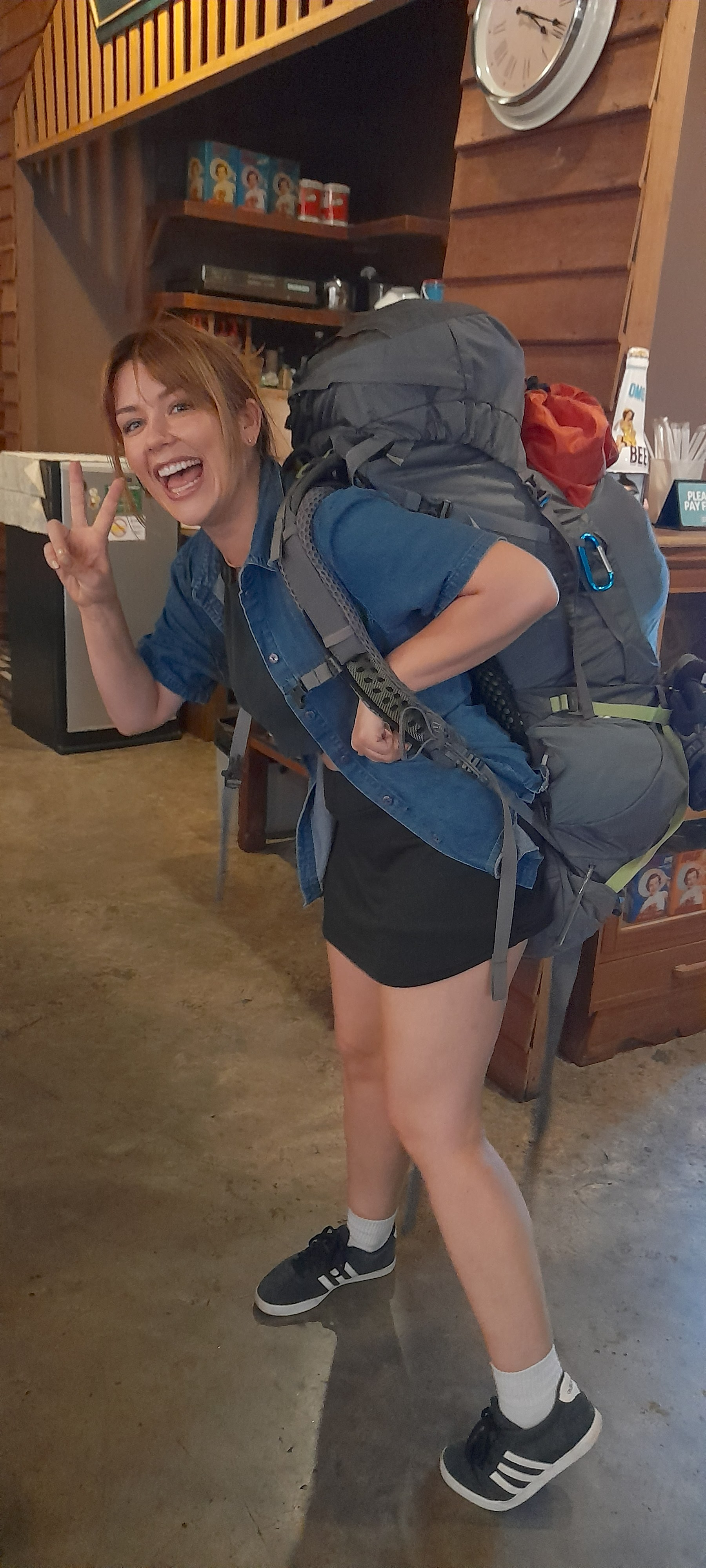
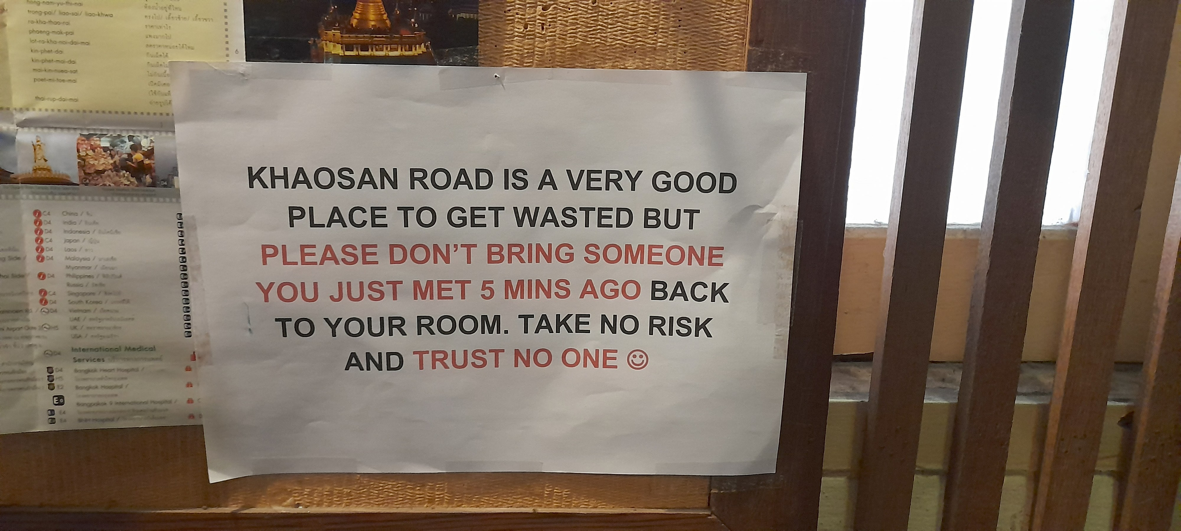
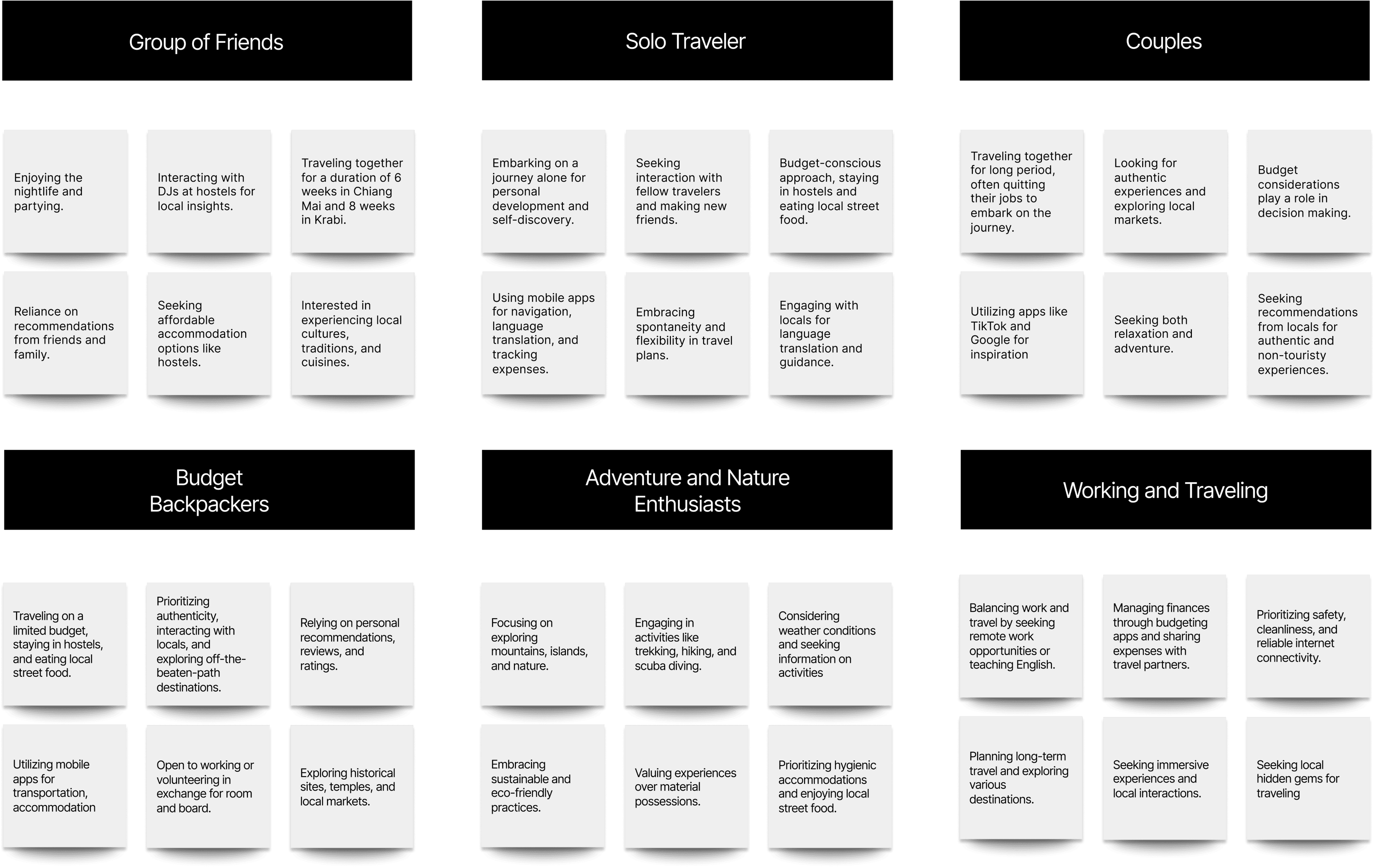
Sorted insights in cards based on similar themes.
We organized the interview results, sorting them based on common motivations, preferences, and travel styles. This approach allowed us to identify patterns and key insights, of the users' needs during each phase of their travel.
We developed 4 personas based from the card sorting.
Each card represented a unique archetype of travelers, encompassing their motivations, preferences, and travel styles. This led us to develop personas. They enabled us to empathize with, and better understand the diversity of user groups.

Sorority Stella.
Stella is traveling with her friends. She parties in groups of four to six, ensuring affordability and safety. Traveling with friends lets her share expenses, making the trip budget-friendly. In a group, she can enjoy security and camaraderie, creating a win-win situation for all.

Khaosan Kevin.
Kevin is a travel enthusiast who loves visiting new cities. However, he has a particular preference for tourist spots. He believes that these spots define a city's essence, and that leaving them feels unfamiliar and inconvenient.

Worry Wong.
Wong is a solo traveler who has been partying too much lately and is starting to feel the financial effects of her partying, and needs to cut back on her expenses. She has decided to seek out affordable experiences with others.

Penny Jenny.
Jenny is low on funds, but she's determined to make the most of her final trip days. She's been saving up for this trip for years, and she doesn't want to let anything get in the way of her having a great time.
Main persona Sorority Stella.

Stella is the ultimate anchor persona for TripSplit because she perfectly embodies the dual priorities of the modern Gen Z backpacker: financial savvy and collective safety. As a young woman traveling abroad on a budget, she naturally seeks out small groups of four to six like-minded travellers to party and explore with, relying on cost-splitting from accommodations and rides to group tours so as to make her journey accessible while building a built-in buddy system for peace of mind. By tailoring TripSplit to her needs, the app directly solves the friction of communal budgeting while creating a trusted, social network that empowers travellers like Stella to explore the world safely and affordably together.
The concept: Trip Split.
Through collaborative brainstorming sessions, we set out to solve two of the biggest friction points for Gen Z backpackers: high travel costs and social safety. The result is TripSplit. A social travel app designed to bring budget-conscious, like-minded travellers together.
TripSplit allows backpackers to create, discover, and join group activities from sharing rental accommodations and private transport to booking local tours and group dinners. By seamlessly pooling resources, travellers can cut expenses, unlock group discounts, and travel safely in numbers. Ultimately, TripSplit isn't just an expense-sharing tool; it's a social network that transforms solo journeys into collaborative, affordable, and safe group adventures.
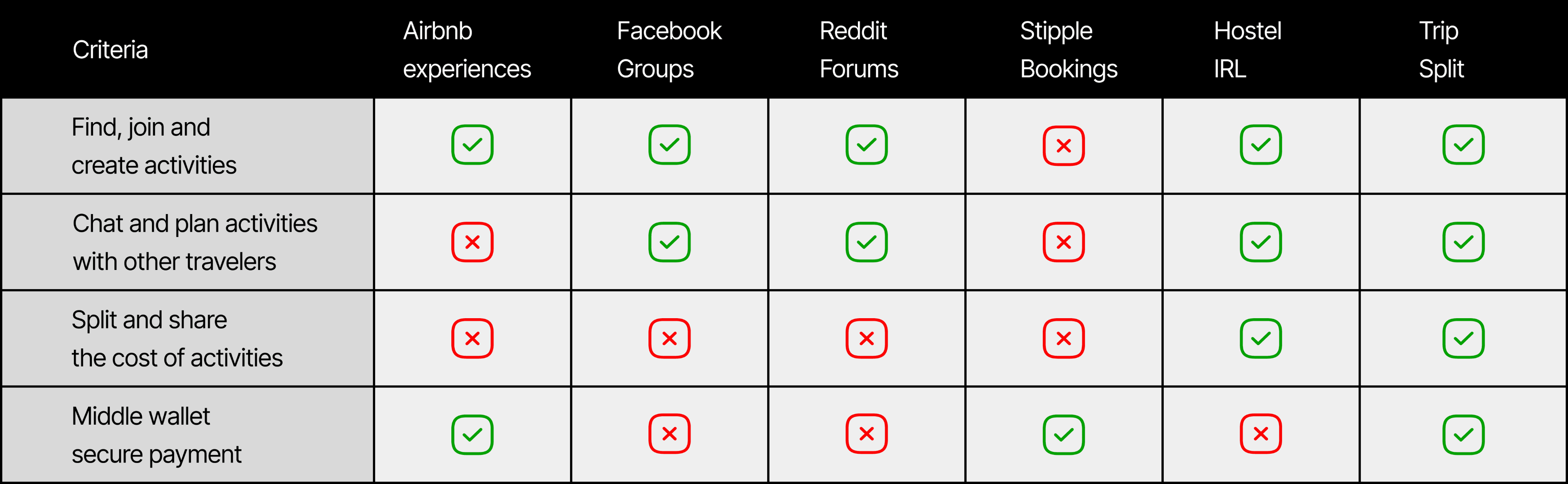
Competitor analysis.
Our competitor analysis revealed a significant gap in the market: while existing travel platforms address isolated needs, none seamlessly combine social connection with financial coordination. By benchmarking competitors across key friction points, activity discovery, community building, cost-sharing, collaborative planning, and in-app communication, we identified what travelers are currently missing and where TripSplit can win.
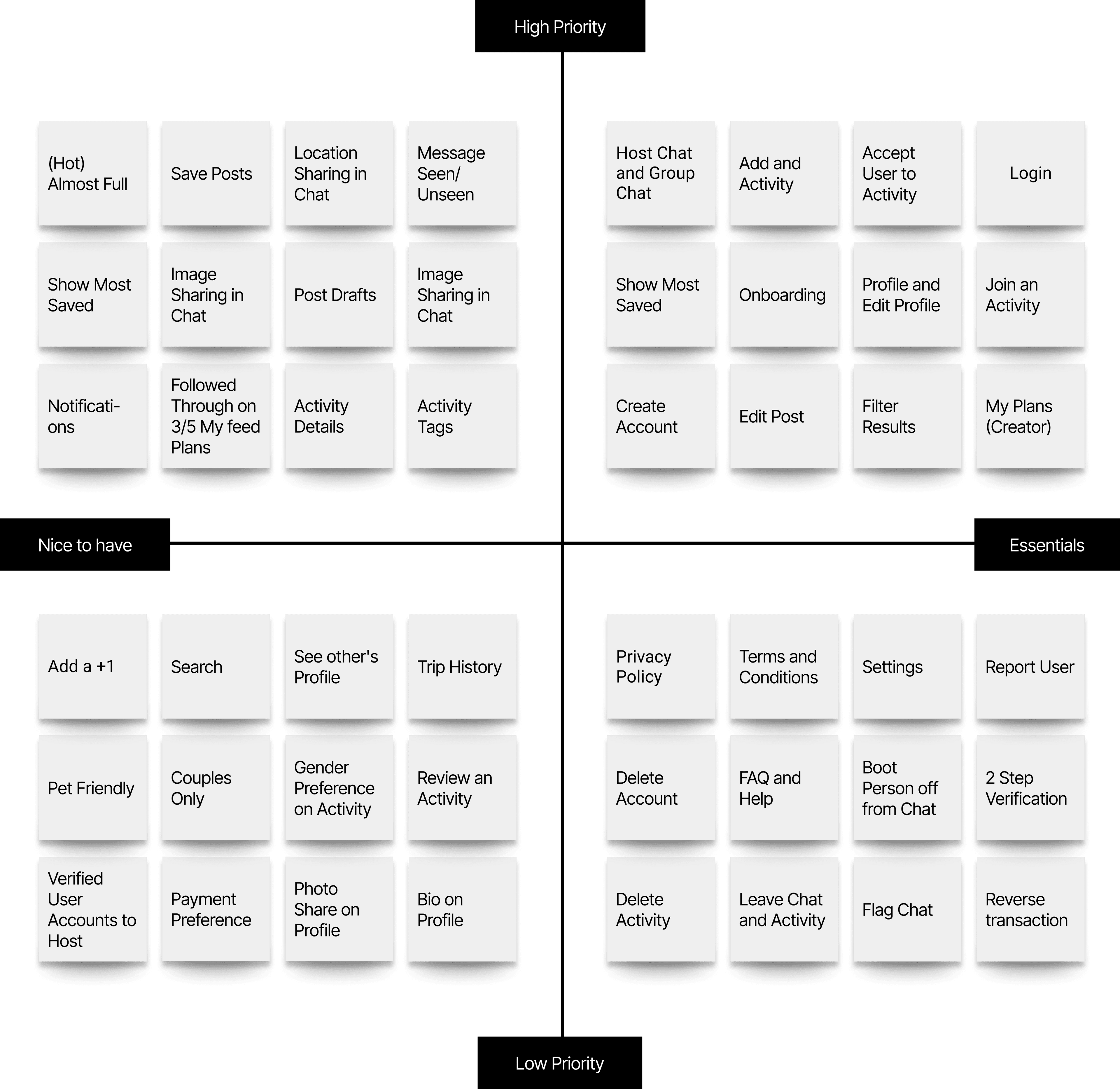
MVP map to validate Trip Split's core functionalities.
For our Minimum Viable Product (MVP), we prioritized a lean, high-impact feature set specifically tailored to validate TripSplit's core value proposition: making collaborative travel effortless, affordable, and safe for Gen Z backpackers. To establish immediate trust and foster genuine connections within the community, the platform opens with a streamlined onboarding process and verified user profiles. From there, travellers can tap into dynamic trip planning tools, build custom itineraries, and discover smart, budget-friendly recommendations for accommodations, local food spots, and shared group activities.
To solve the dual challenges of social connectivity and group logistics, the MVP incorporates a vibrant travel community feed alongside automated, multi-currency cost splitting that eliminates the awkwardness of shared expenses. We also integrated real-time messaging, essential offline access for itineraries and receipts while navigating abroad, and third-party API integrations for payment and mapping services. Together, this carefully curated feature set provides a complete, purposeful user experience that proves our core concept while setting the foundation for future platform growth.
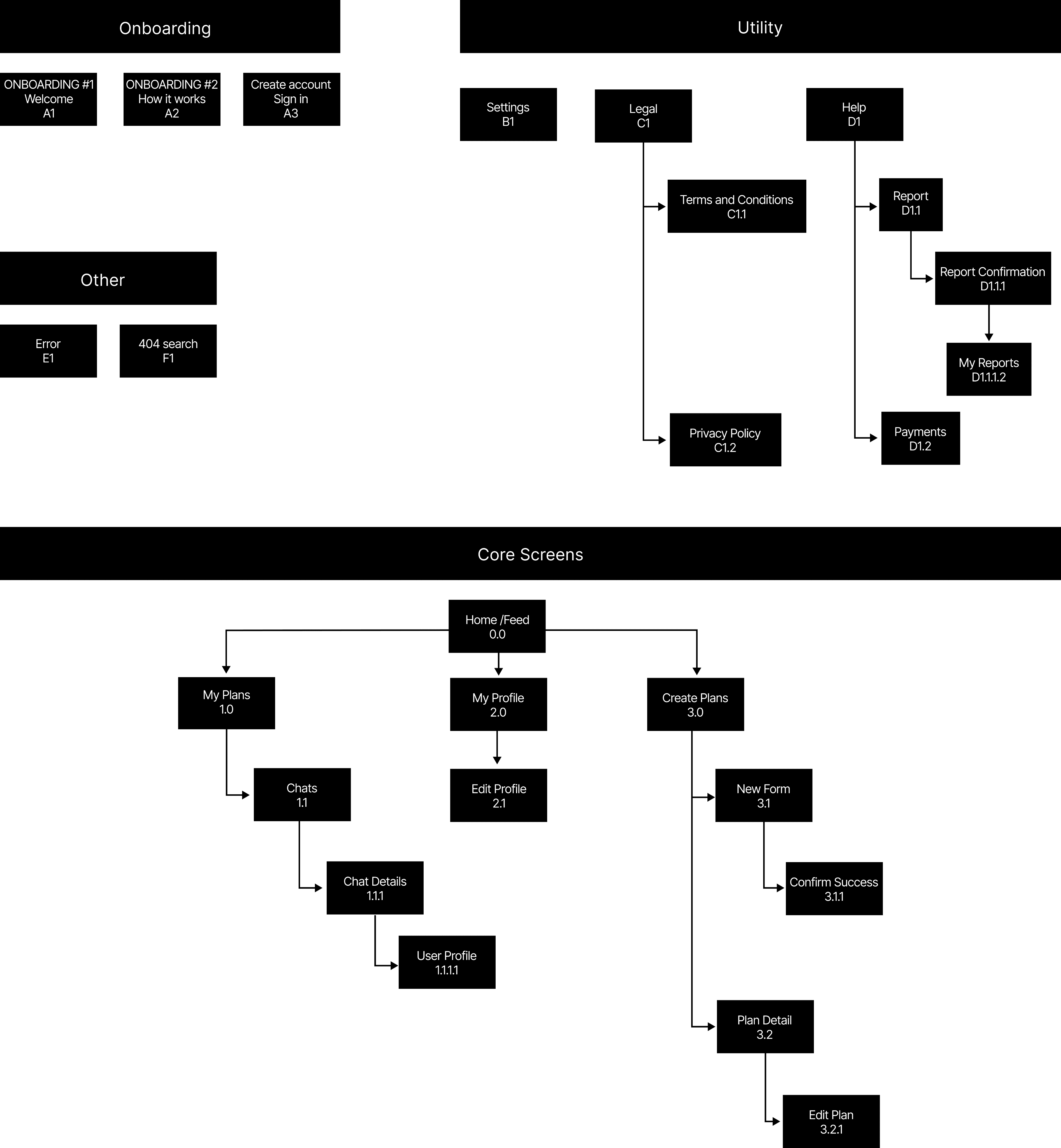
Sitemap to visually organize the content and structure.
Lonely Planet set out to build the ultimate native mobile application, a seamless digital companion designed to enrich and bridge their existing library of guidebooks, digital tools, and website content. Tailored specifically to the distinct habits of Gen Z travelers, the app serves two core personas: The Backpacker, who seeks budget-conscious, social, and spontaneous adventures, and The Well-Traveled Adventurer, who craves authentic, off-the-beaten-path experiences with elevated curation. By integrating effortlessly into Lonely Planet's broader ecosystem, the app acts as an intelligent co-pilot across every phase of the journey, ensuring the brand's trusted voice is accessible anywhere, anytime.
To deliver end-to-end value, the platform supports travelers before, during, and after their trips through a mix of creative, user-centric features. Users can easily discover, save, and book curated accommodations, local dining gems, and must-see sites, while enjoying real-time tools that help them navigate destinations on the ground. Beyond logistics, the app fosters a vibrant, interconnected travel community by enabling users to connect with fellow explorers, share native trip logs, and publish post-travel recommendations. The result is a unified digital ecosystem that turns passive reading into active, shared, and unforgettable real-world exploration.
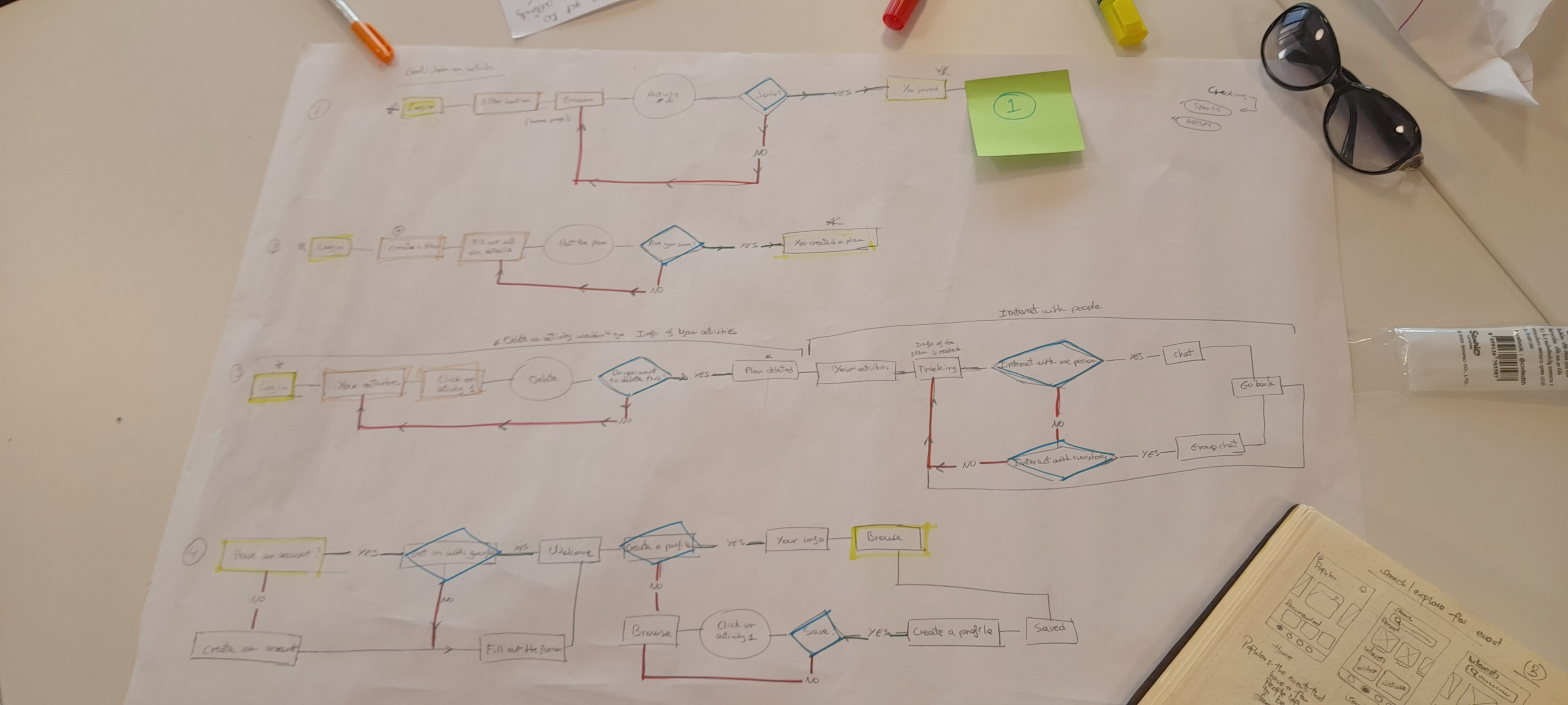
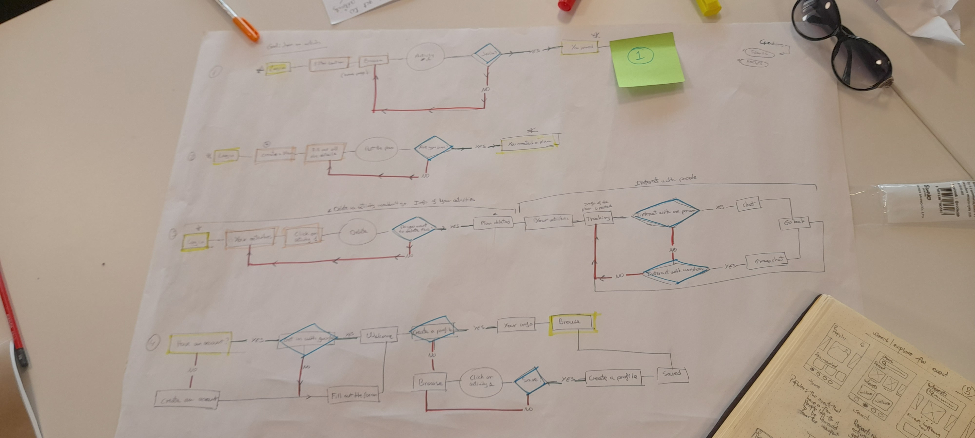
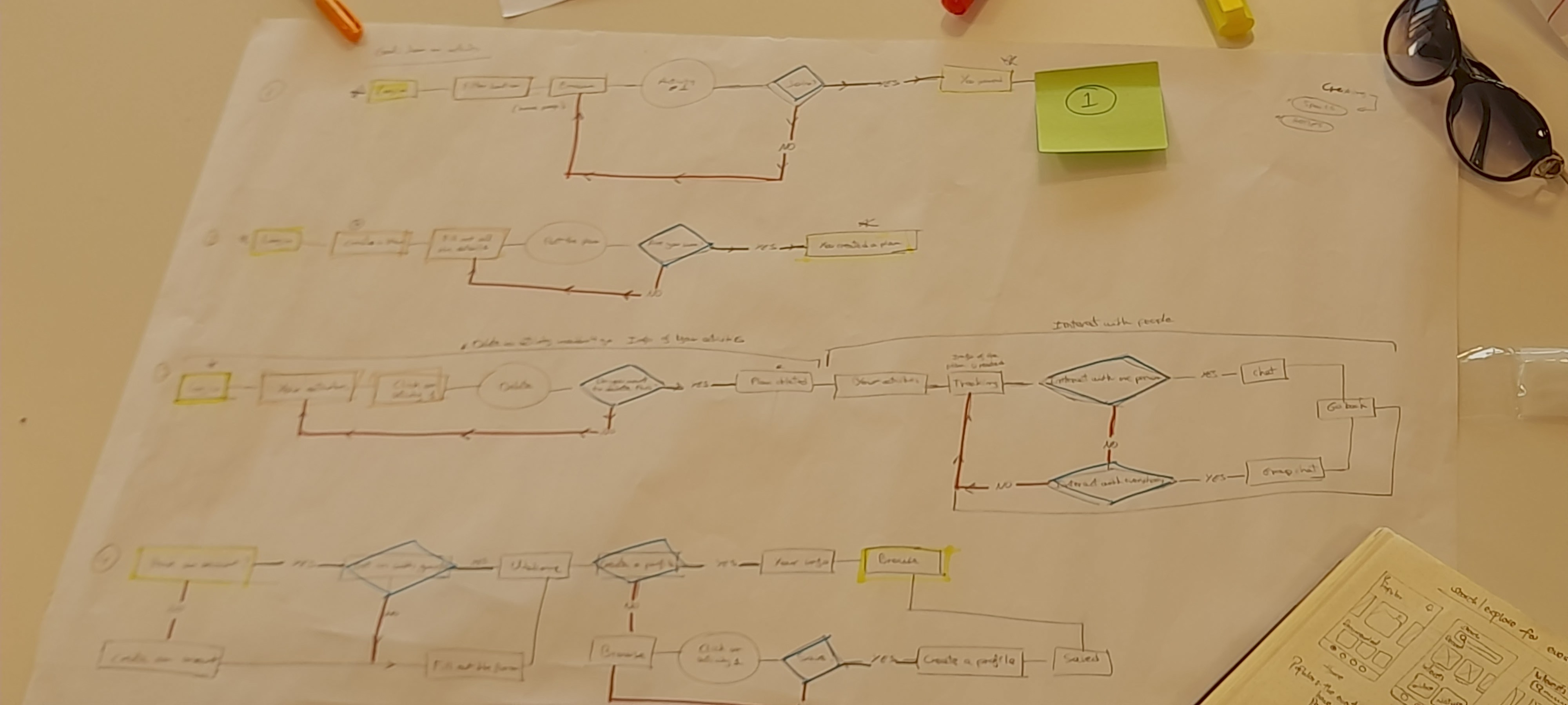
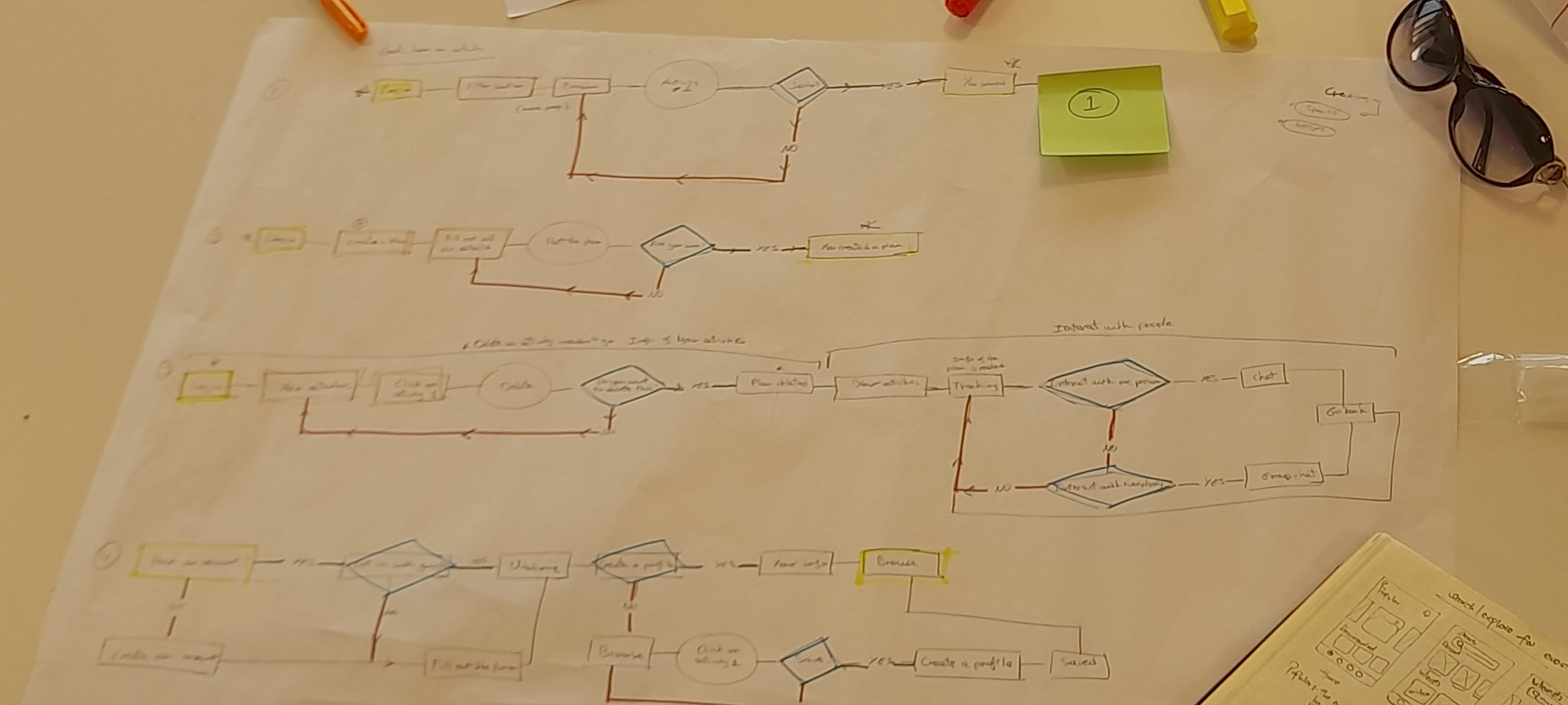
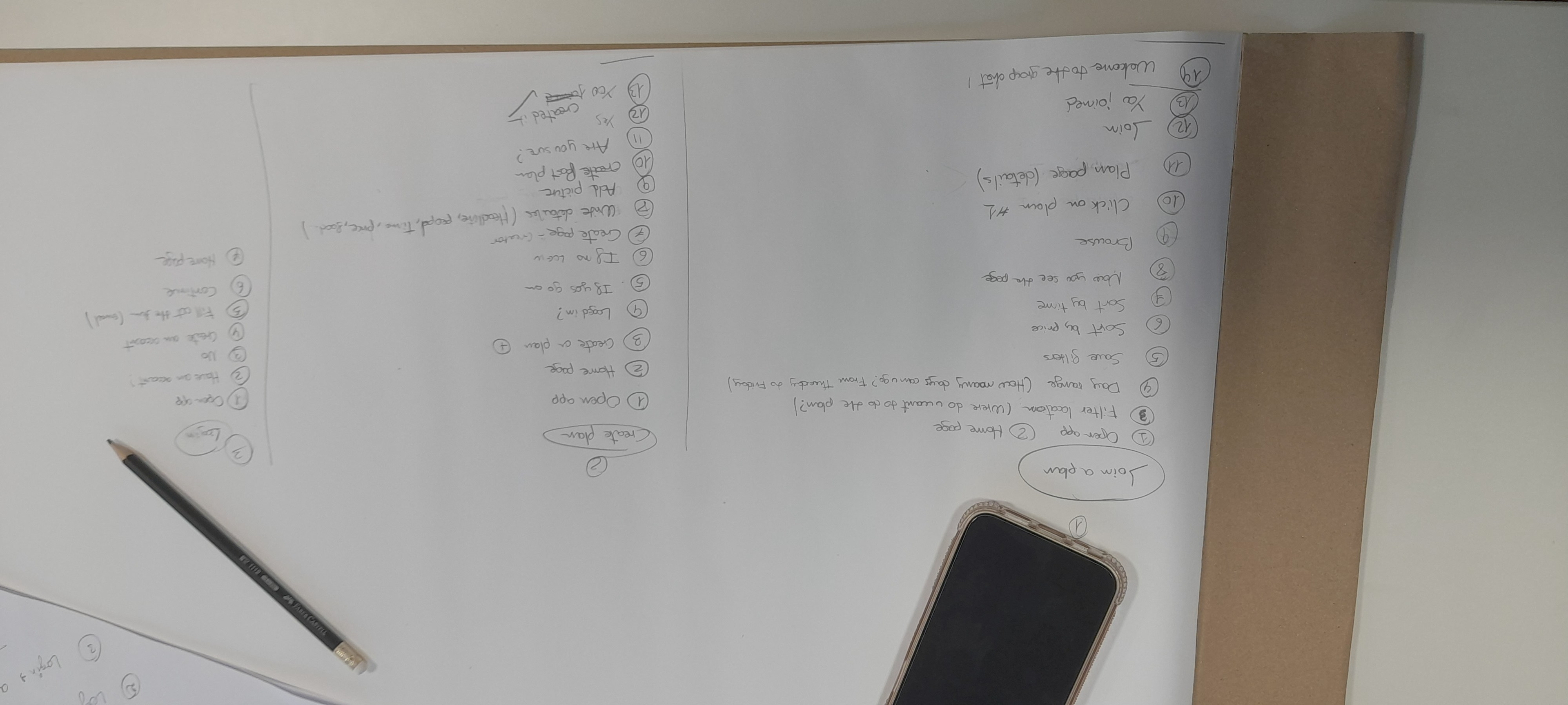
User flows to visualize the journey our users would use to plan and split the cost.
Mapping the user flow was a critical step in shaping TripSplit's user experience design, providing a clear blueprint to analyze the logical sequence of user interactions from start to finish. By visualizing every step a backpacker takes, from discovering an activity to splitting a final bill, we were able to identify friction points, eliminate redundant steps, and streamline the overall interface. This rigorous task analysis ensured that complex actions, such as multi-currency expense management and group chat onboarding, felt intuitive, effortless, and tailored to the fast-paced habits of Gen Z travellers.
Beyond usability optimization, these user flows played a vital role in proactive error prevention and cross-functional alignment. By anticipating edge cases, such as spotty offline connectivity or payment disputes within a group, we designed intuitive safeguards directly into the interaction hierarchy before writing a single line of code. Ultimately, the user flows served as a powerful communication tool among designers, developers, and stakeholders, ensuring a shared vision for a seamless, secure, and delightful travel app.
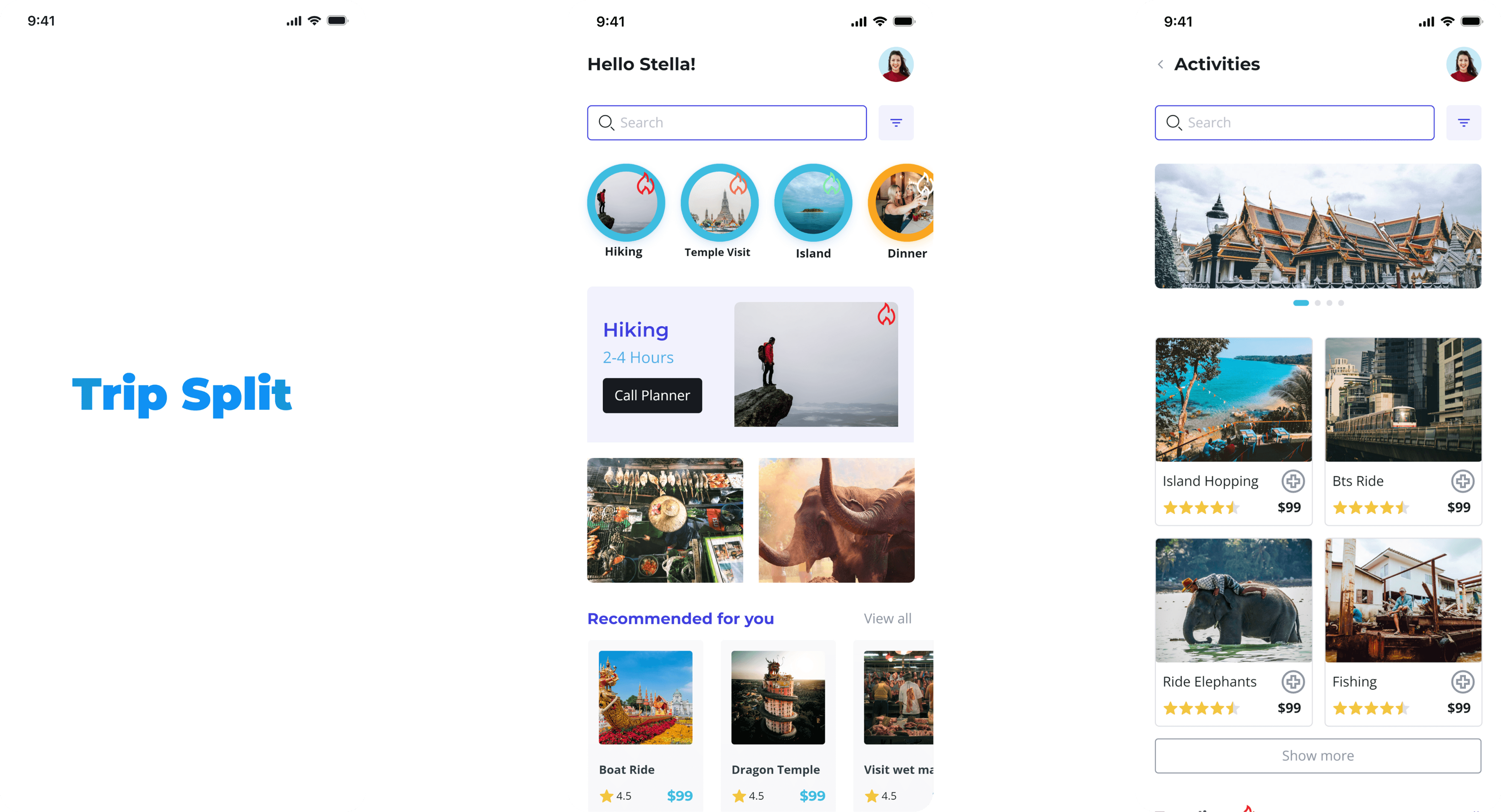
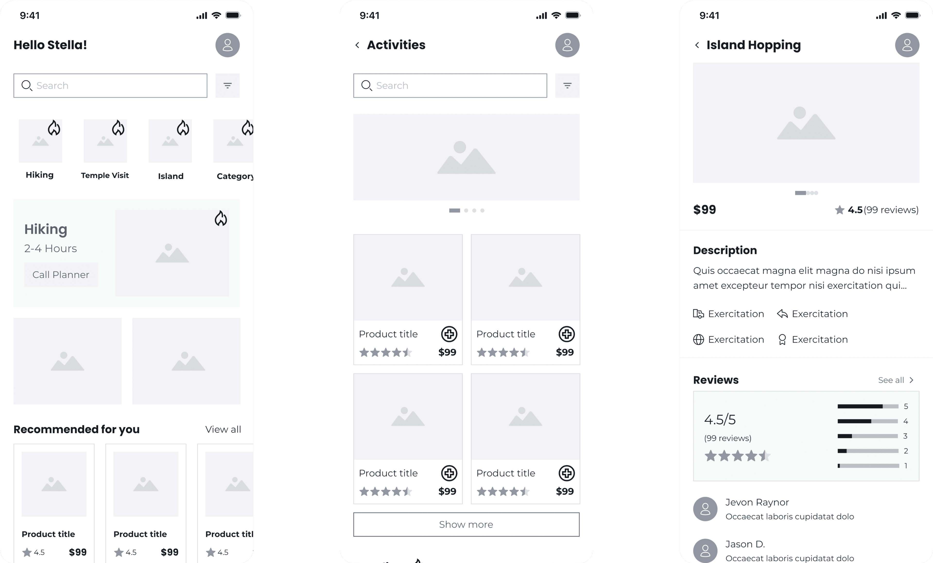
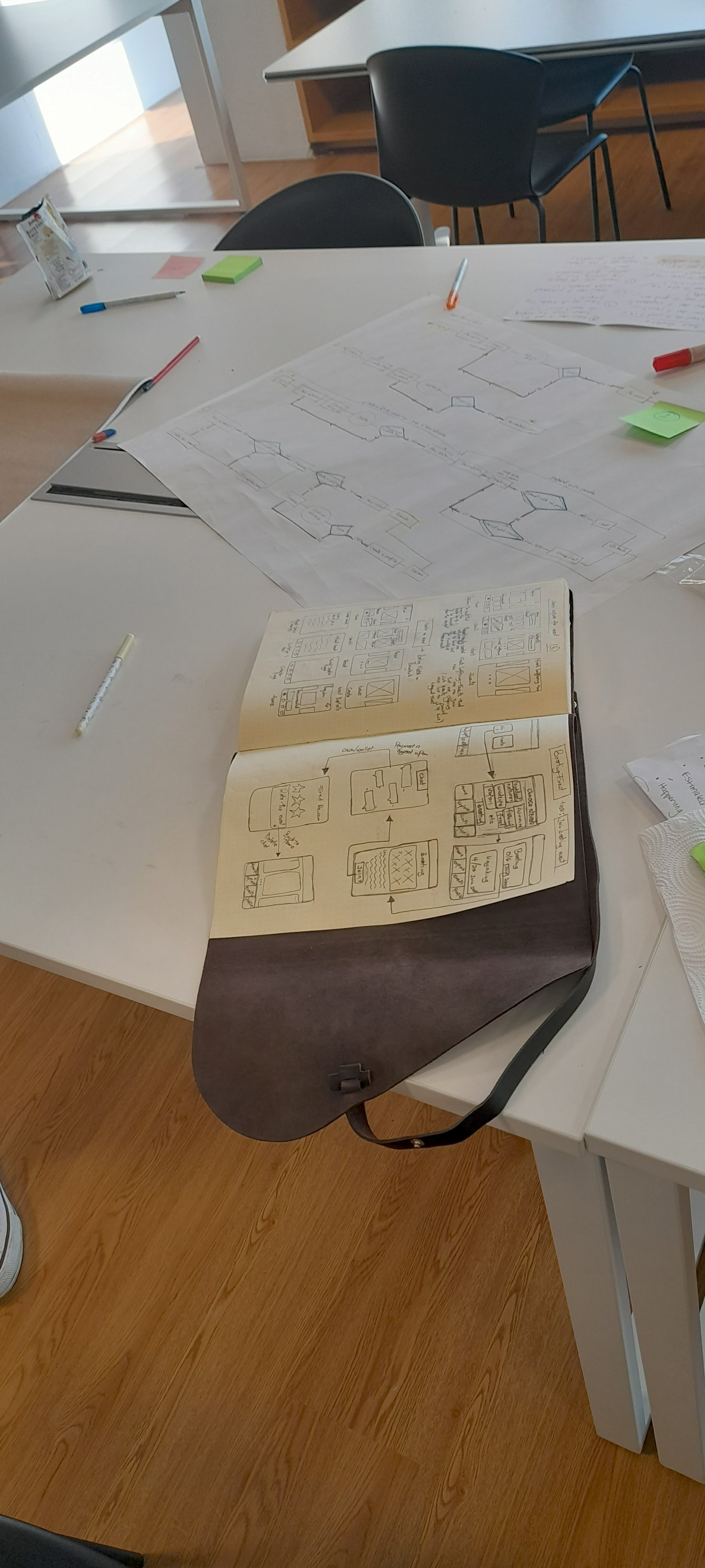
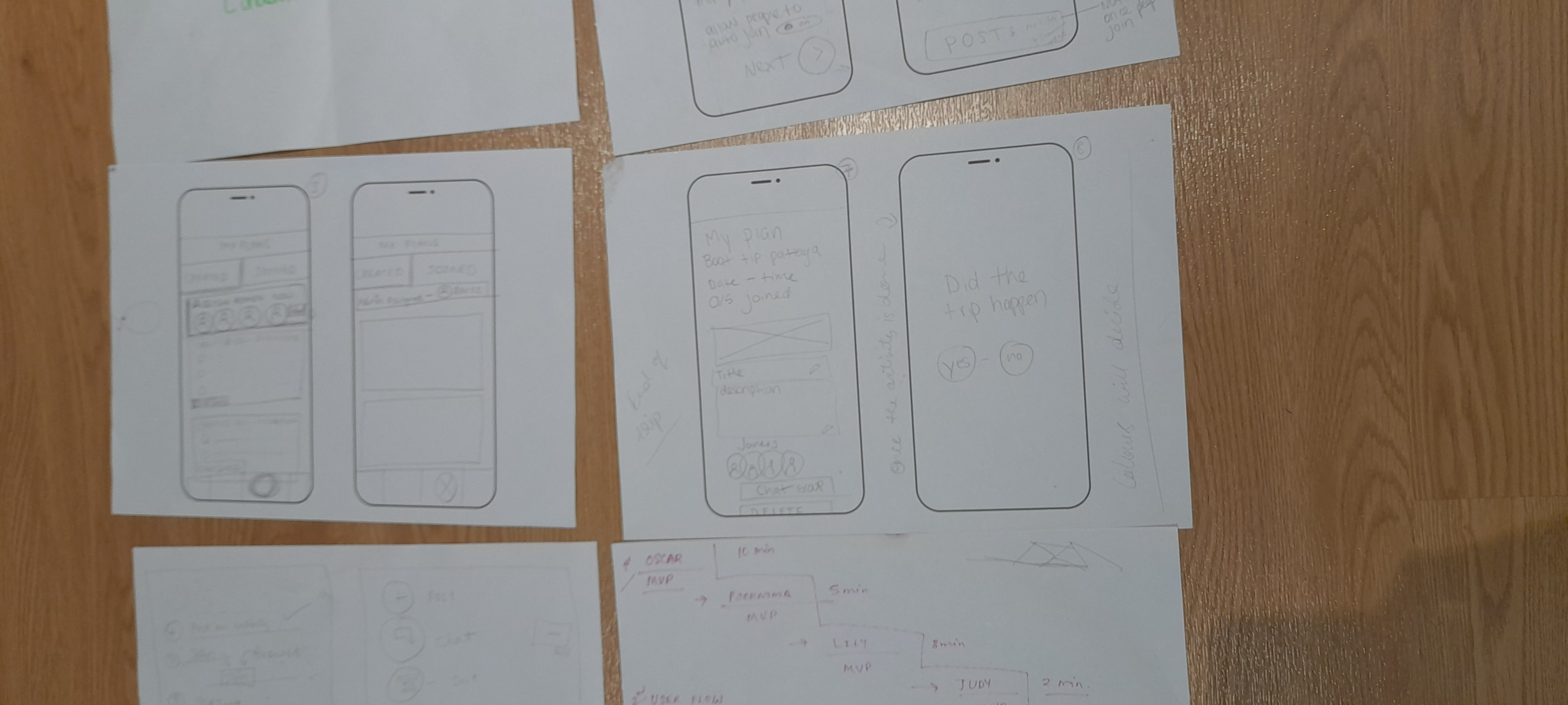
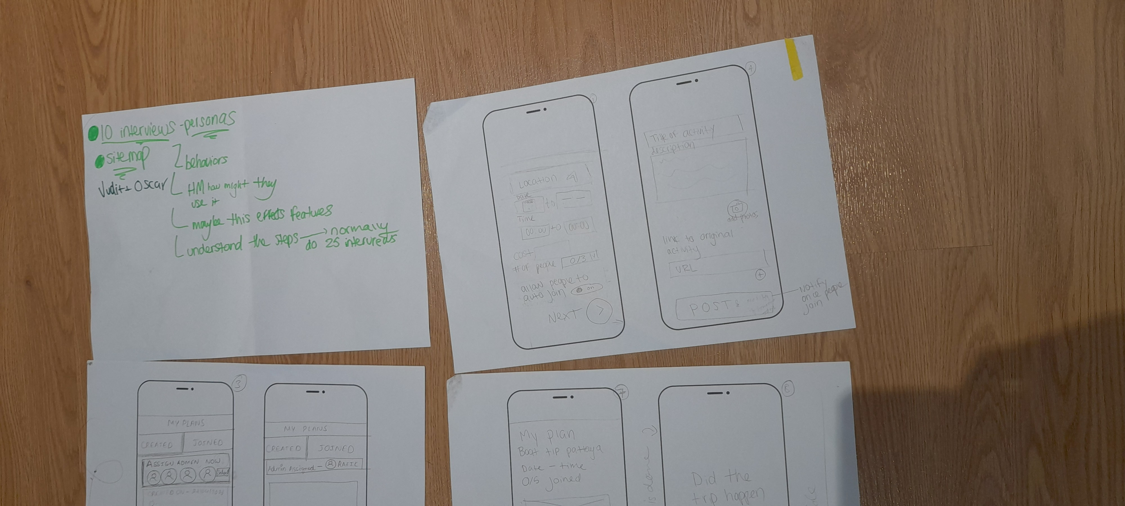
Wireframes to visualize the layout and basic Trip Split app functionalities.
Building directly from the user flows, wireframes were essential for translating abstract interactions into a clear, visual layout of TripSplit's core interface. By mapping out the precise sequence of screens, structural hierarchies, and key interaction points, the wireframes allowed us to test and refine screen transitions, content layouts, and functional elements such as expense inputs and group chat feeds well before visual design.
This structural blueprint ensured that navigating complex multi-user tasks remained smooth, intuitive, and frictionless for travellers on the go, while keeping our design and development teams completely aligned on the product's foundational layout.
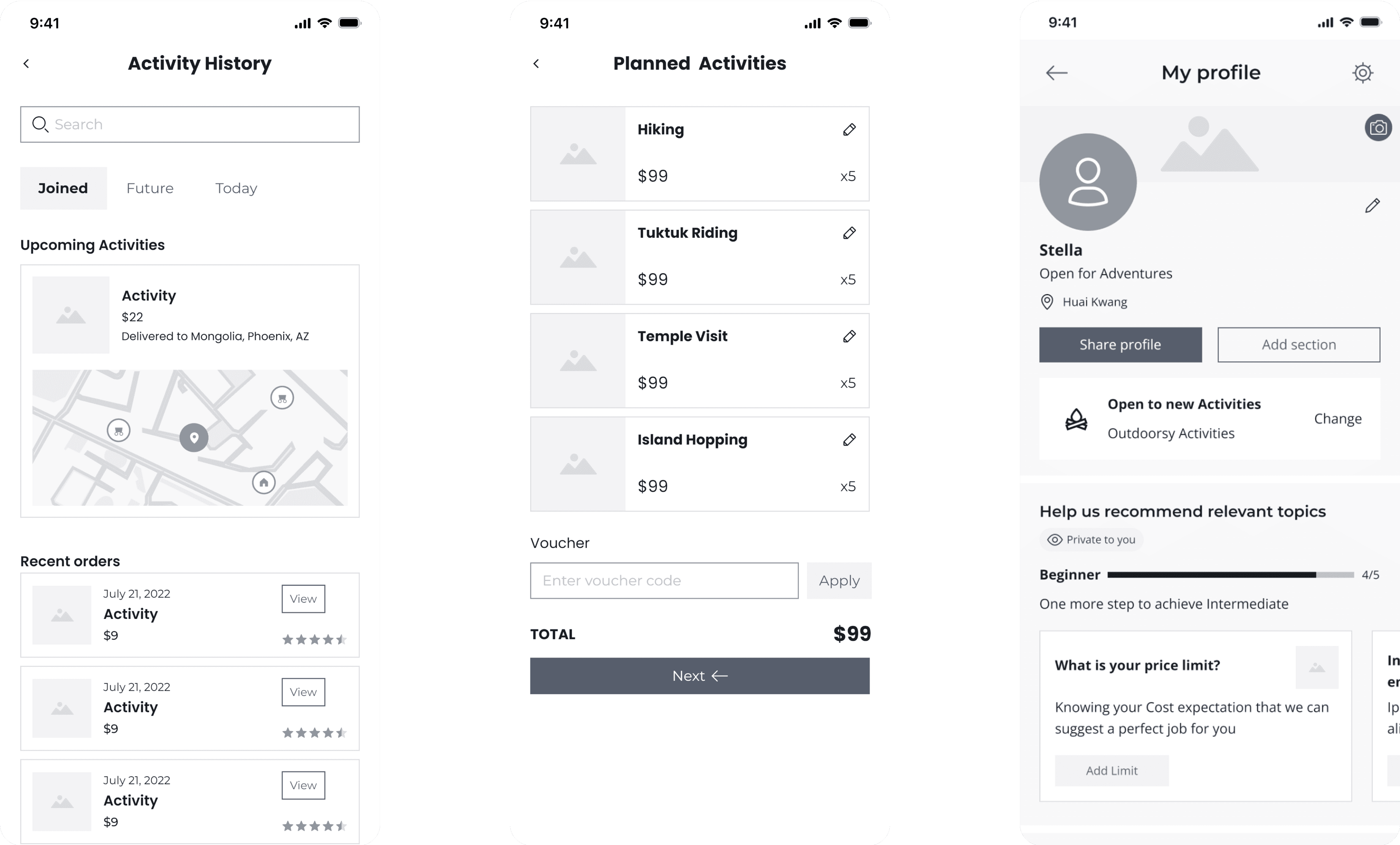
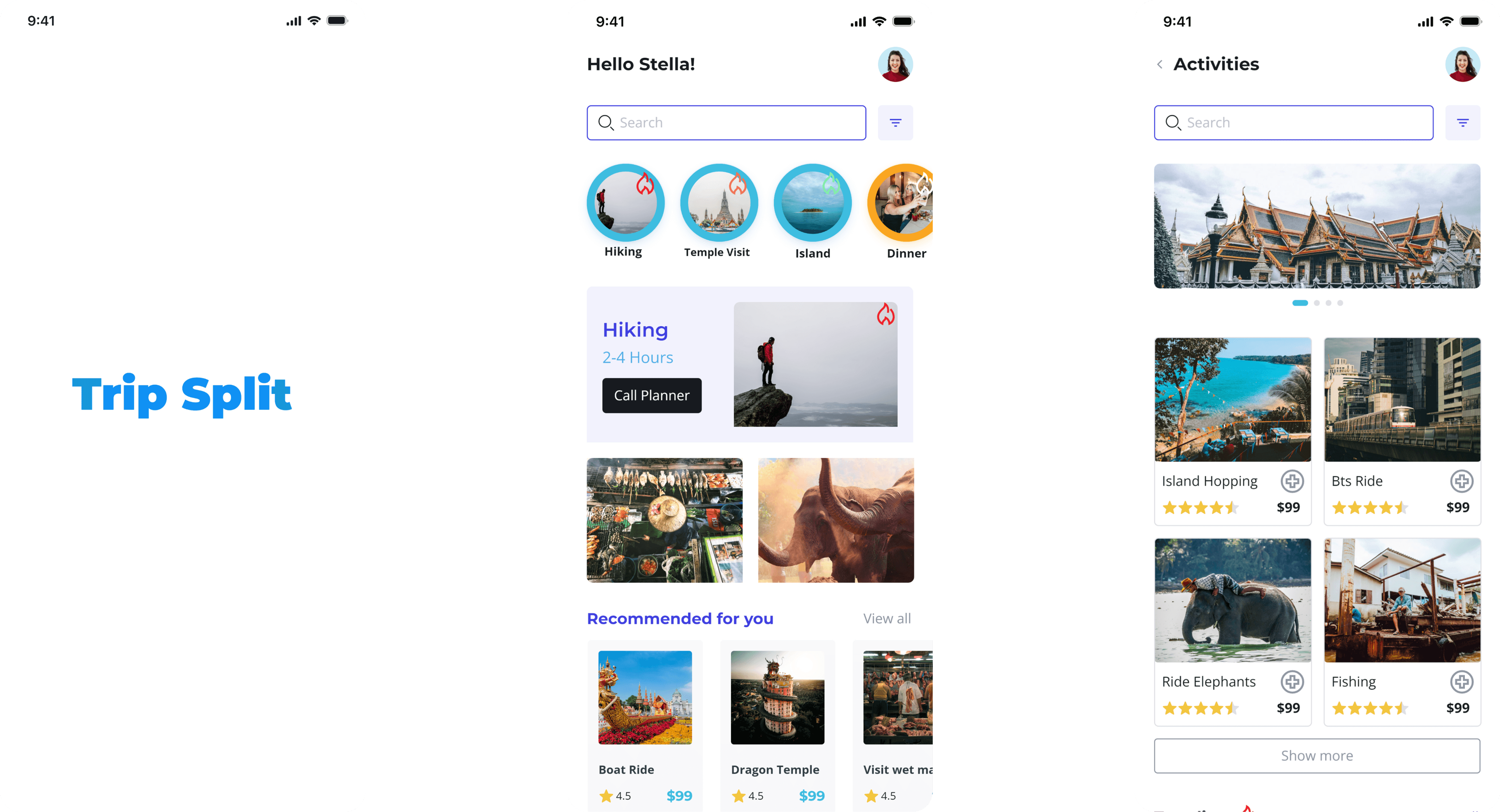
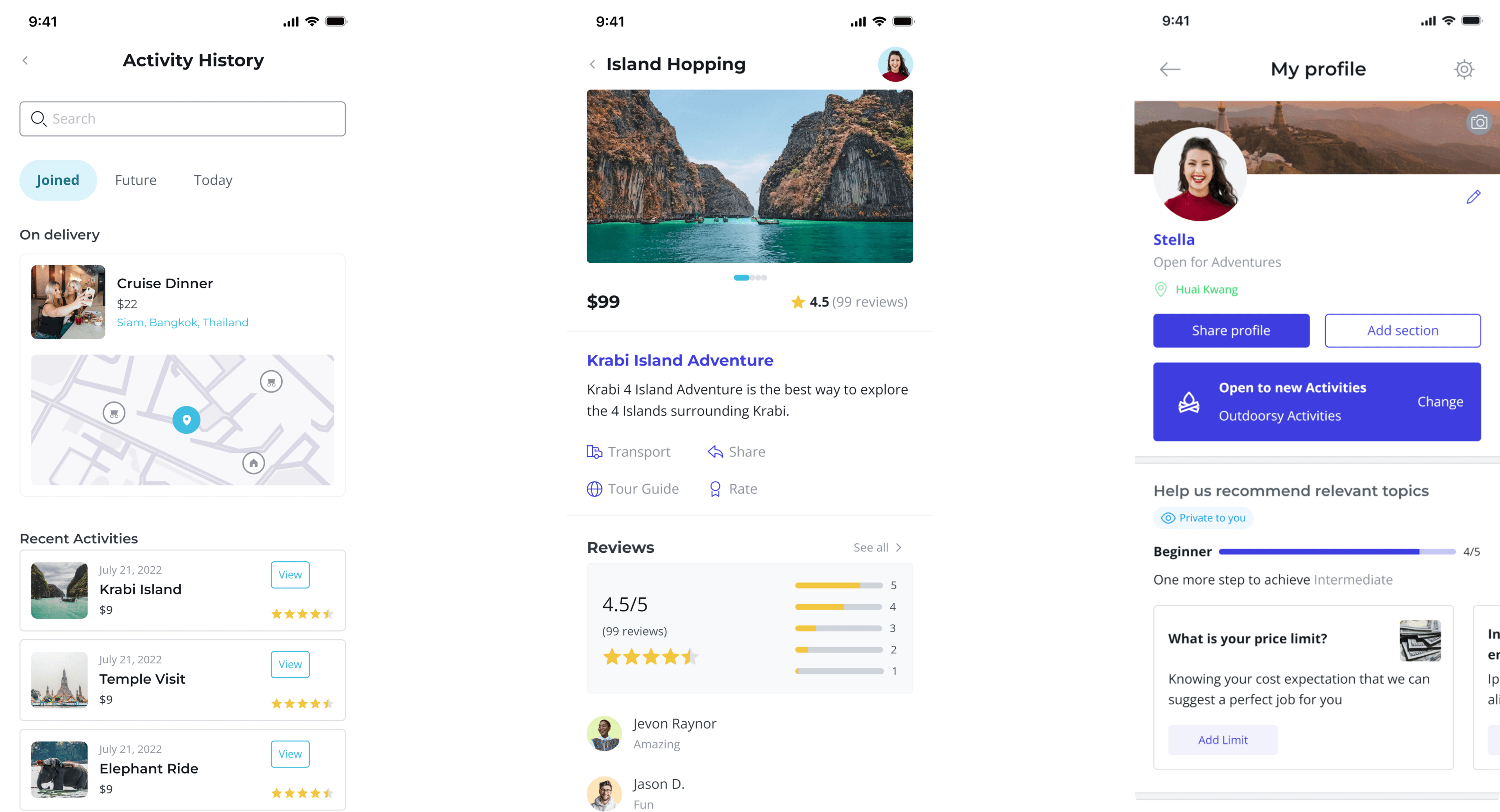
High fidelity wireframes.
Building high-fidelity prototypes was crucial for validating TripSplit's visual design and functionality against real Gen Z backpacker needs. By delivering a realistic, interactive preview of the final app, we were able to conduct meaningful usability testing, gathering direct feedback on the overall look, feel, and navigation before entering production. Crucially, these interactive mockups served as an unambiguous, pixel-perfect blueprint for our development team, bridging the gap between design and engineering to ensure every feature, transition, and micro-interaction was implemented correctly and seamlessly.
My key takeaways.
Reflecting on the development of TripSplit underscored the transformative power of a truly user-centric approach. Immersing ourselves in the daily realities of Gen Z backpackers proved that great design begins with deep empathy, listening to user pain points, observing real-world behaviours, and continuously iterating based on direct feedback. Developing this product reinforced how vital it is to balance creative visual design with rigorous technical fundamentals. Skills in information architecture, user flow mapping, and interaction design were not just technical checkboxes, but essential tools for translating complex, multi-currency social planning into an intuitive, seamless experience.
Crucially, this project highlighted that exceptional digital products are rarely built in isolation; they are forged through collaboration, transparent communication, and data-informed decision-making. Working across design, engineering, and product strategy required a shared vocabulary and an unwavering alignment on core user needs. Navigating edge cases, testing prototypes, and refining key features like safety controls and cost-splitting mechanics taught us that design thinking is an ongoing dialogue, one that bridges user desires with technical feasibility to build genuine trust.
In closing, the lessons gleaned from building TripSplit extend far beyond traditional UI/UX principles. They encapsulate a broader commitment to designing with empathy, fostering community, and leveraging technology to create real-world impact. I am eager to witness the ripple effect TripSplit will have on the global backpacking community as it makes travel safer, more accessible, and deeply collaborative. Filled with anticipation for the journeys ahead, this experience serves as a powerful reminder that when we design for connection, we empower travellers to share not just expenses, but unforgettable human experiences.
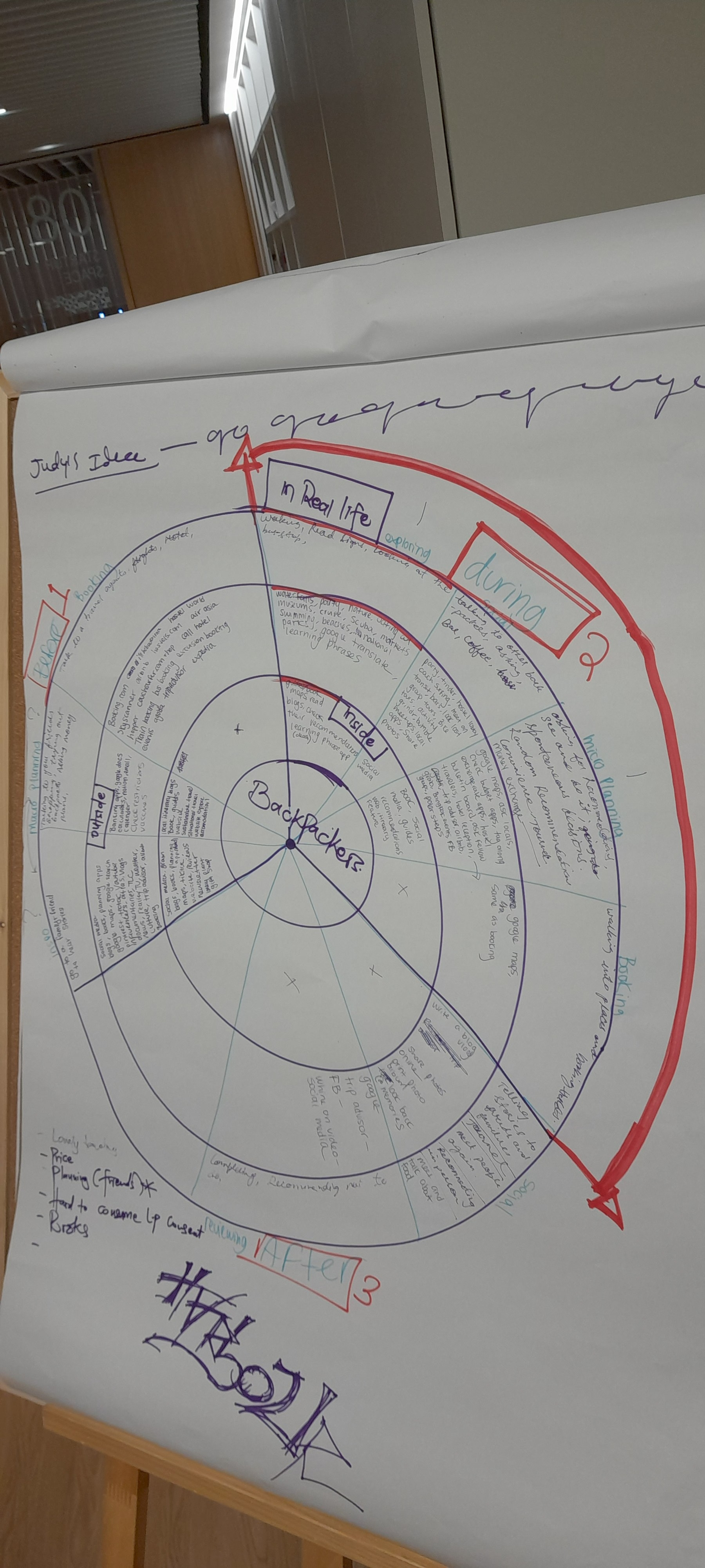
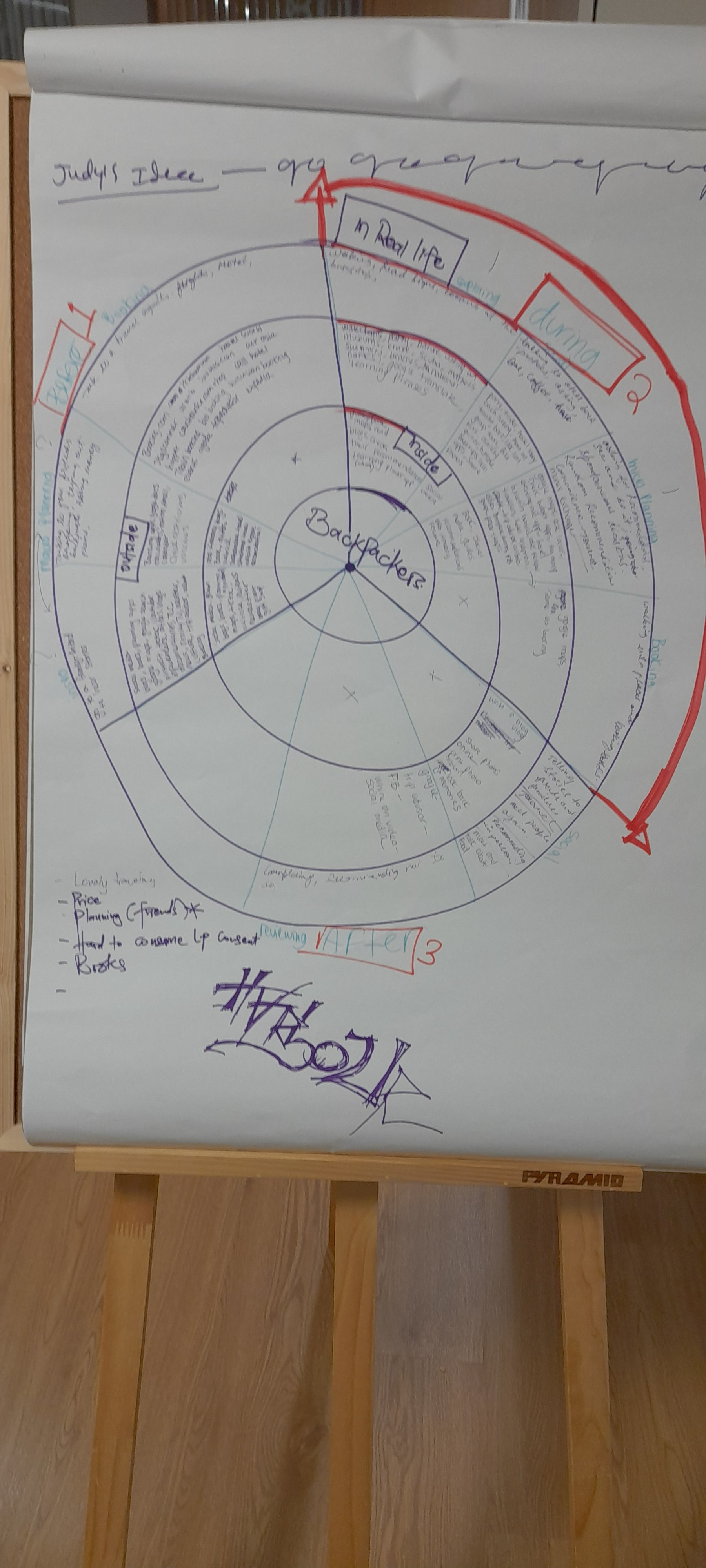
A look behind the scenes.
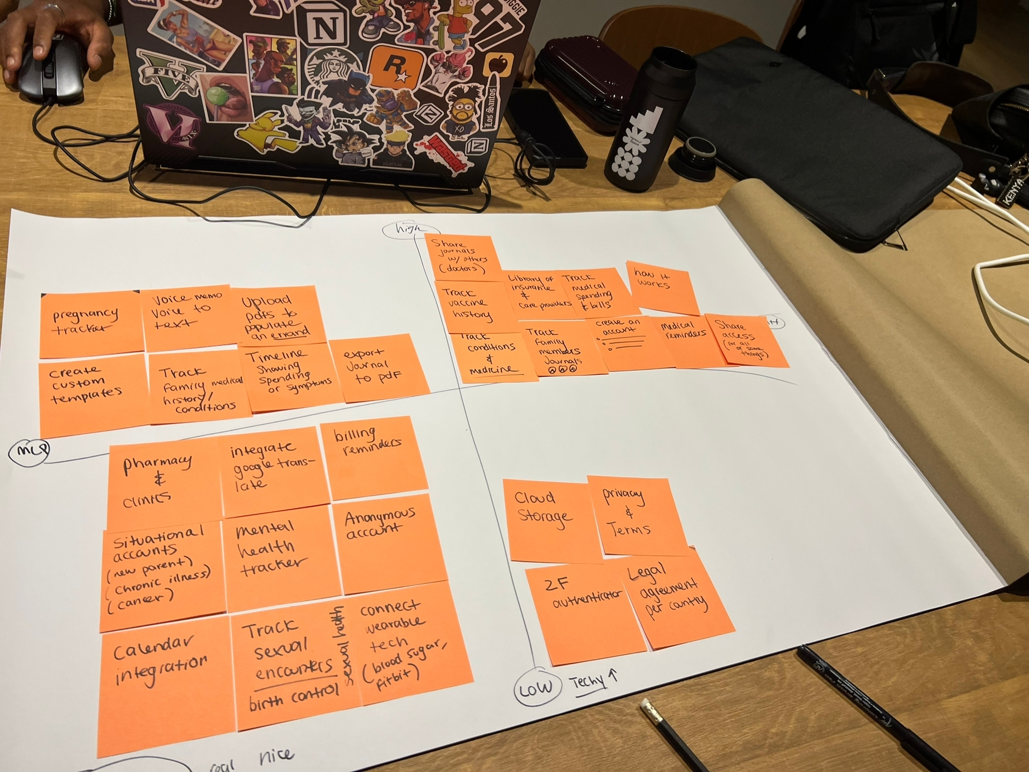
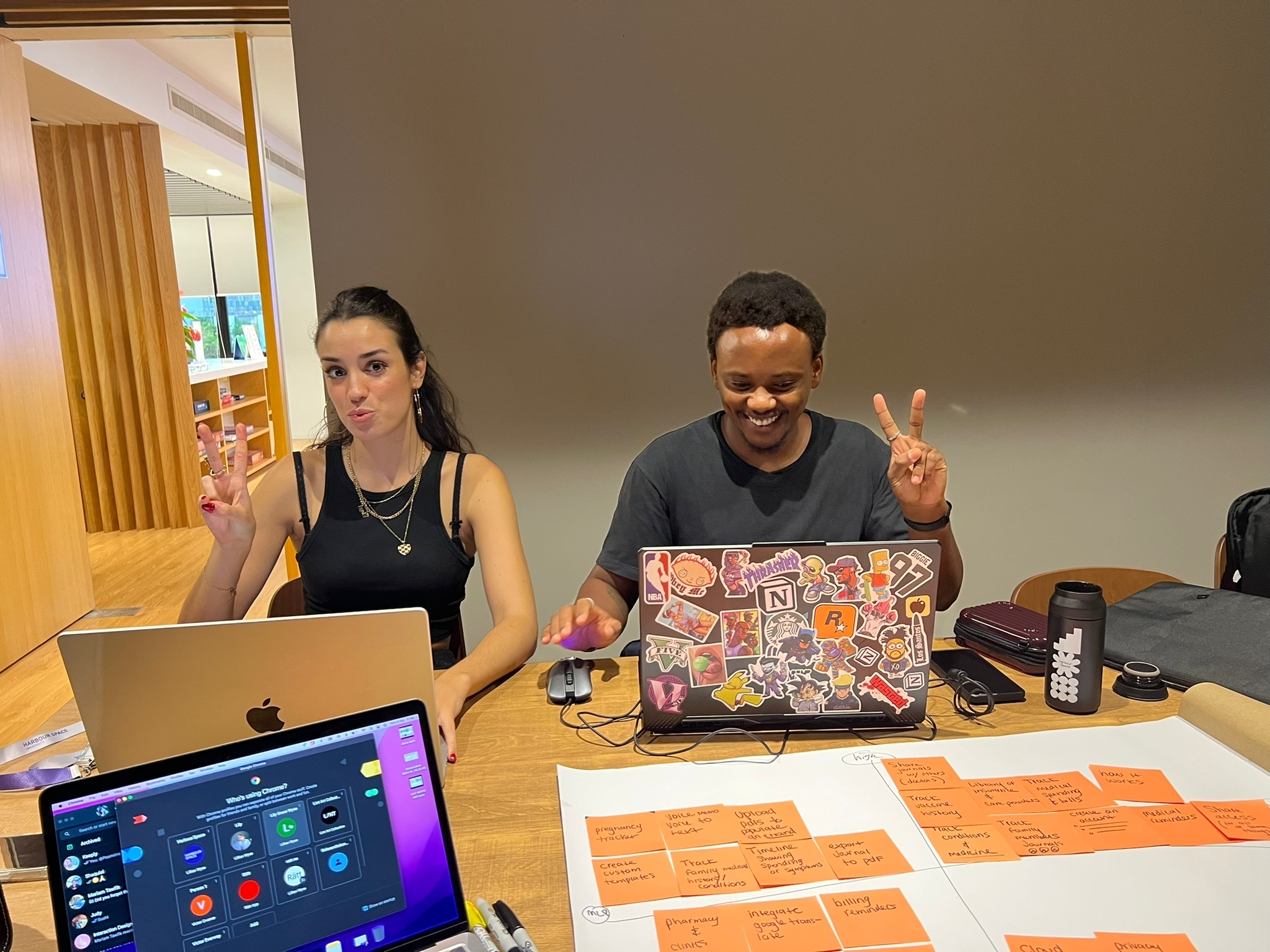
From whiteboard sketches to late-night wireframing sessions, here's a glimpse into the process behind TripSplit — the workshops, the collaboration, and the moments that shaped the product along the way.
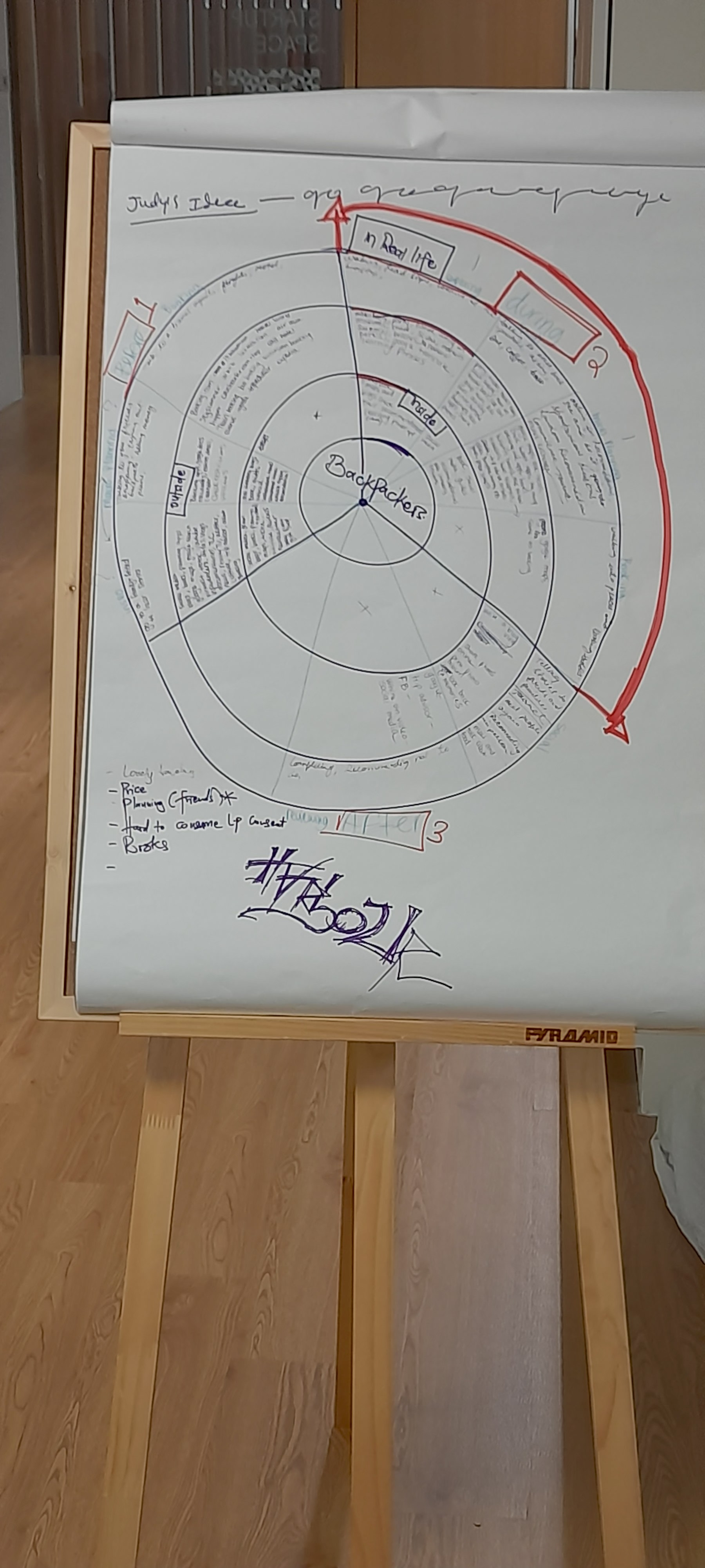
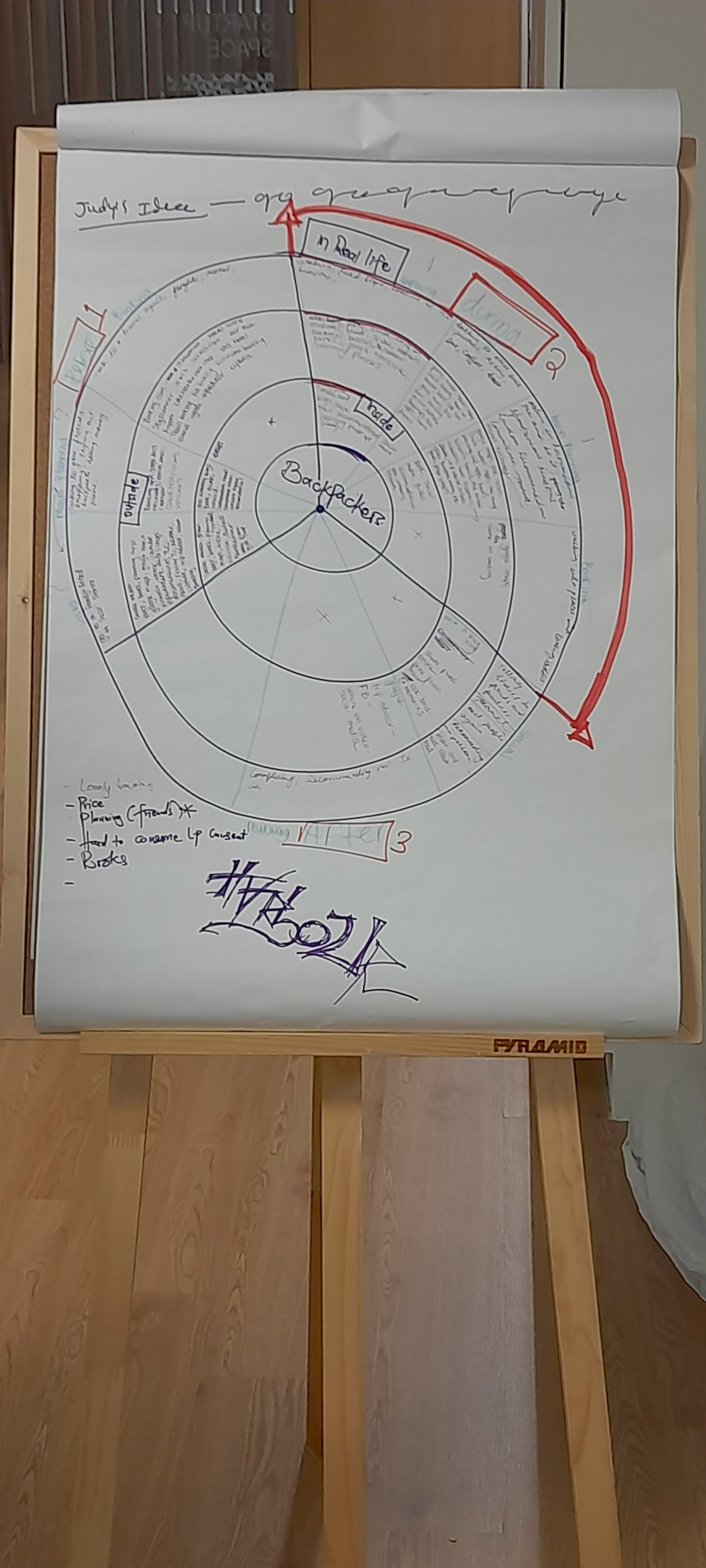
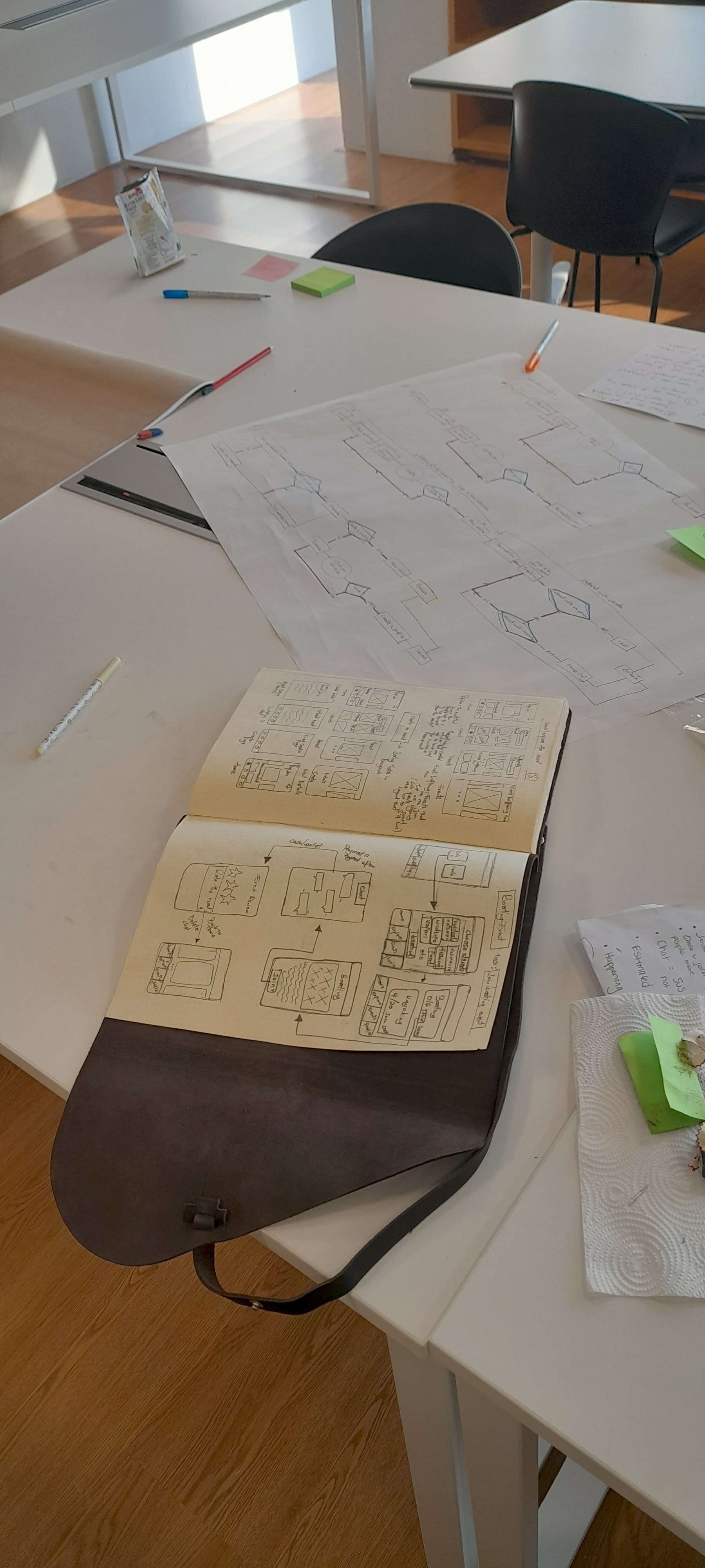
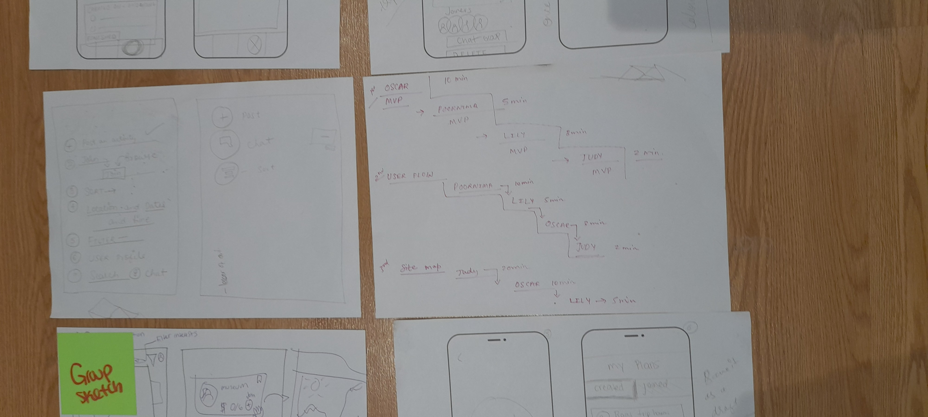
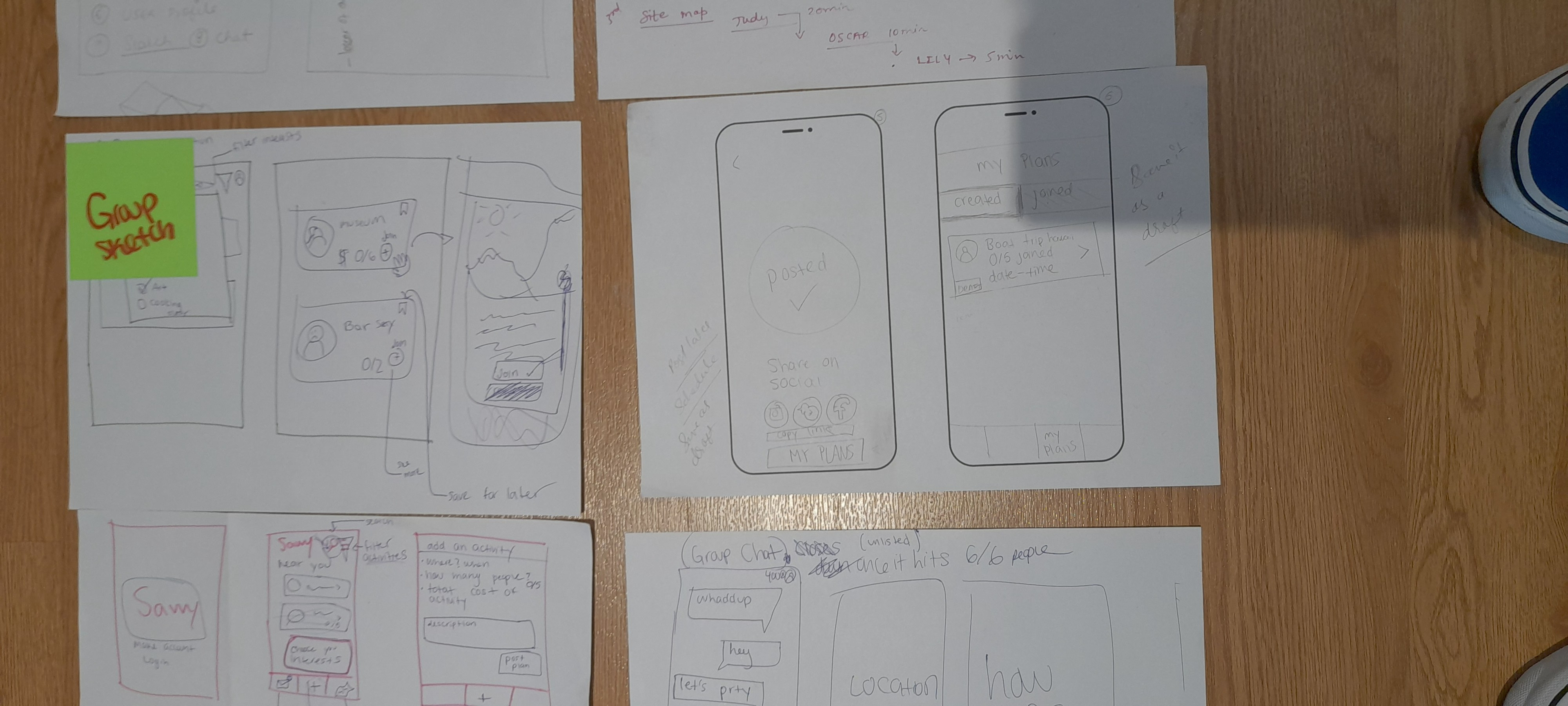
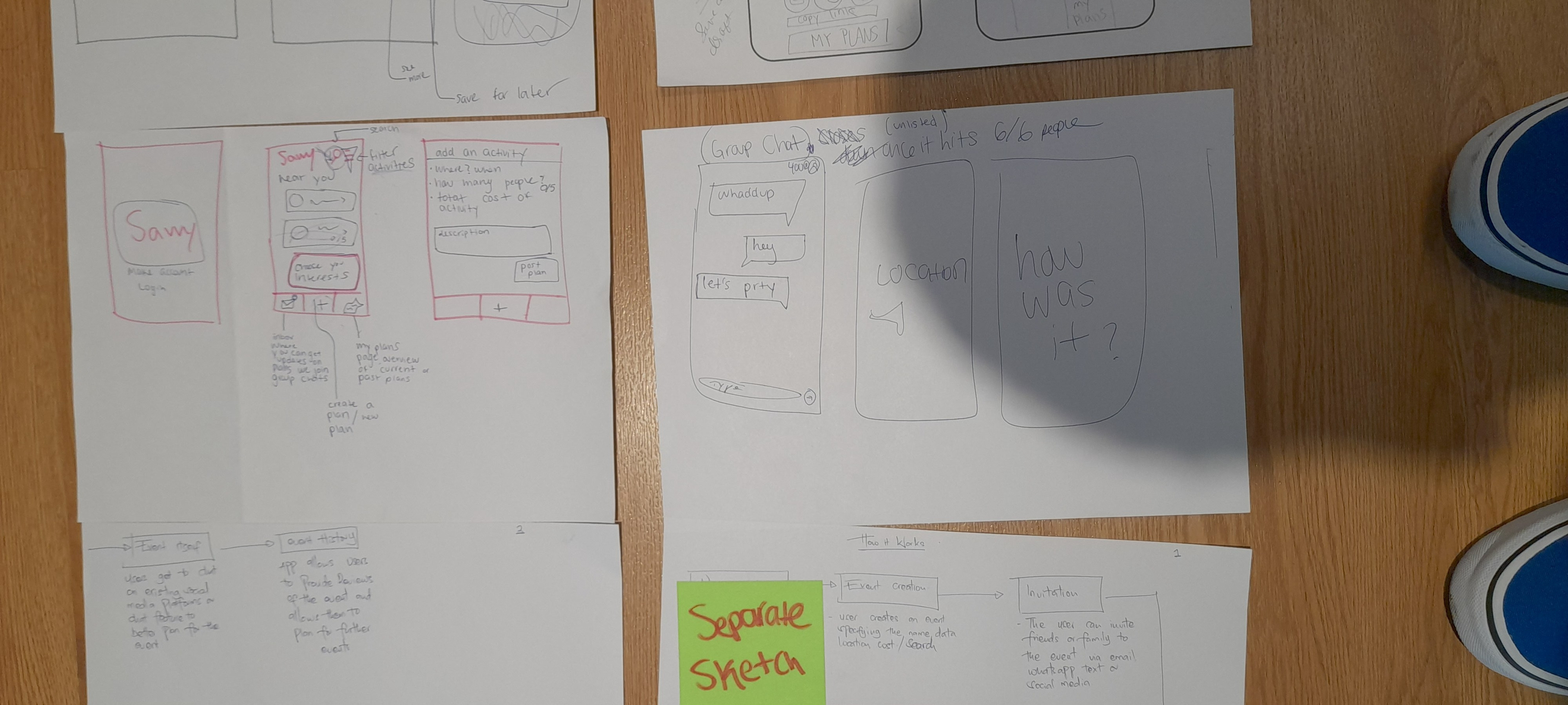
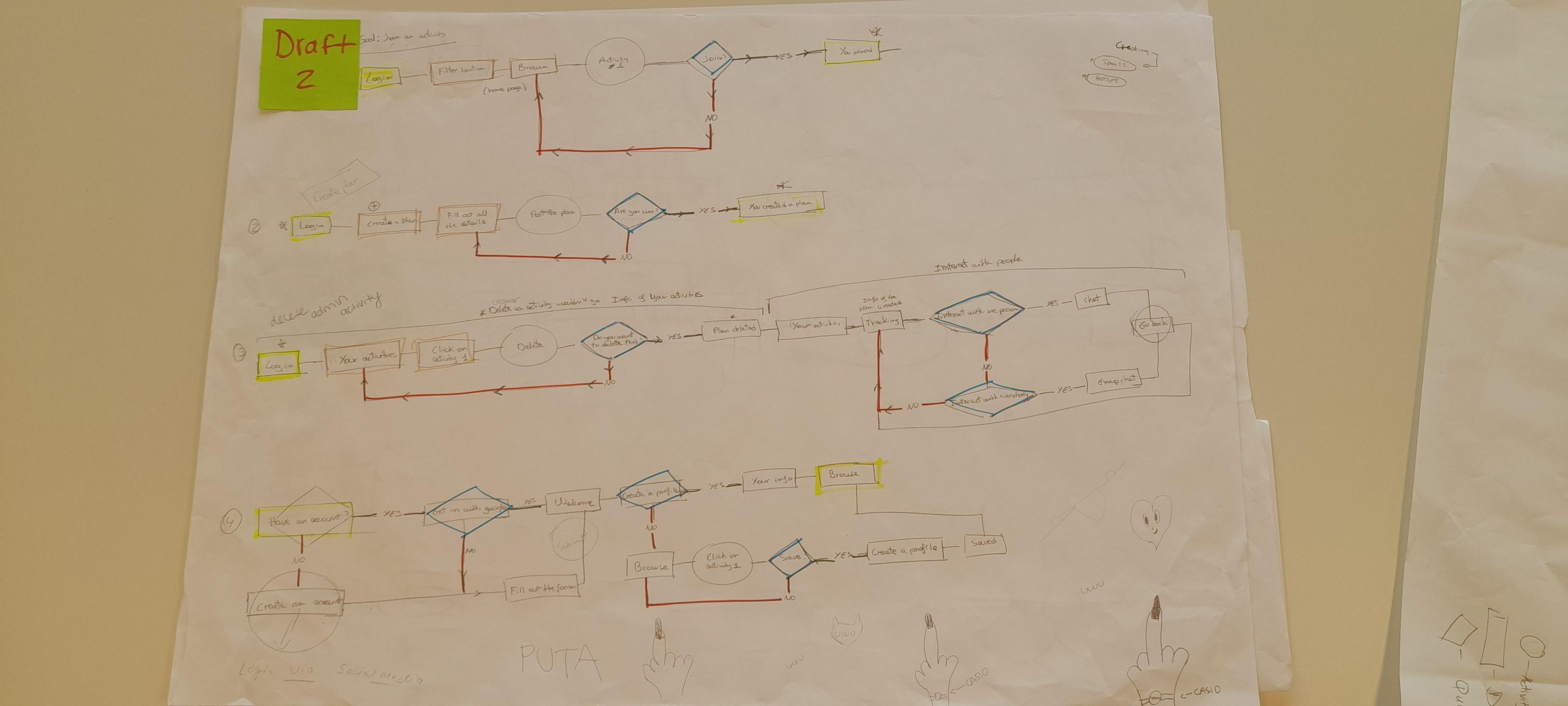
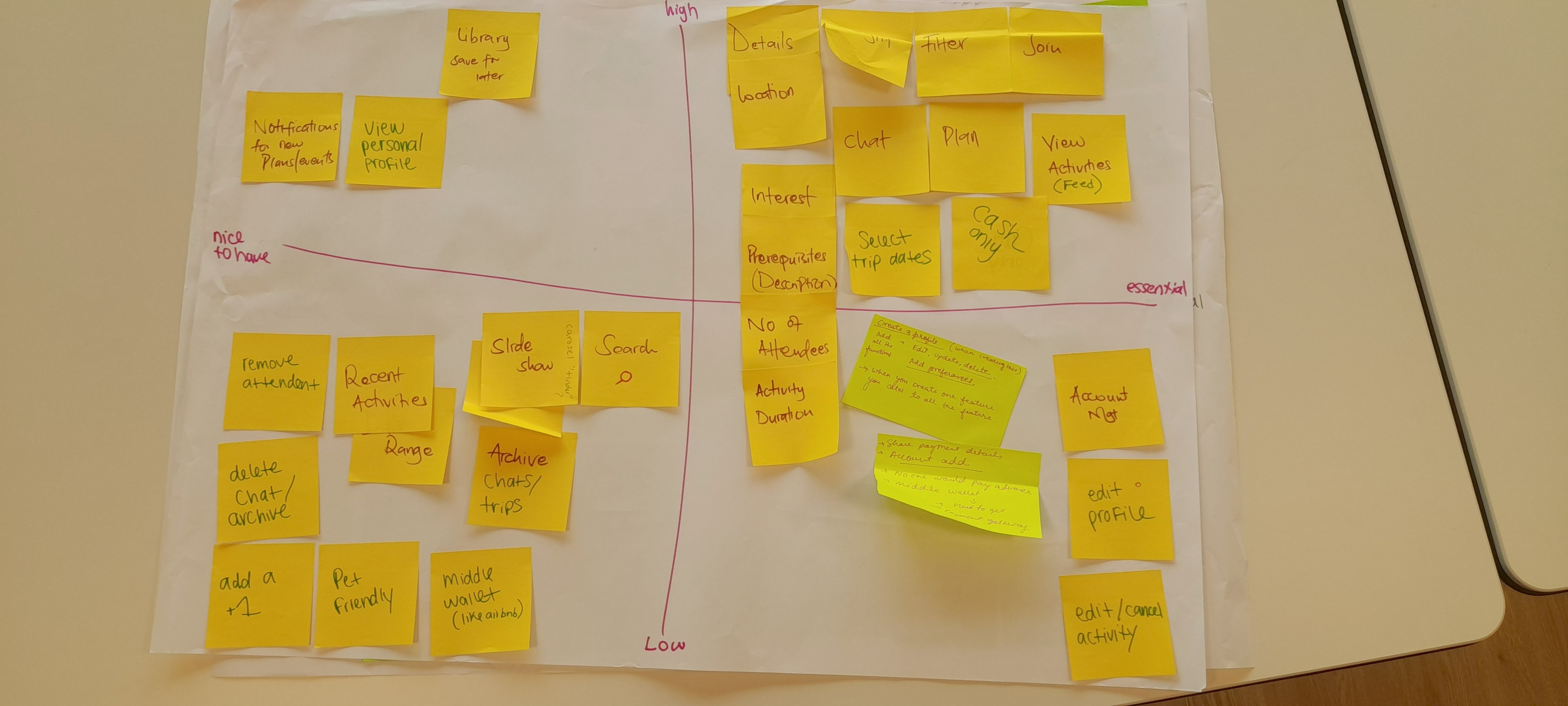
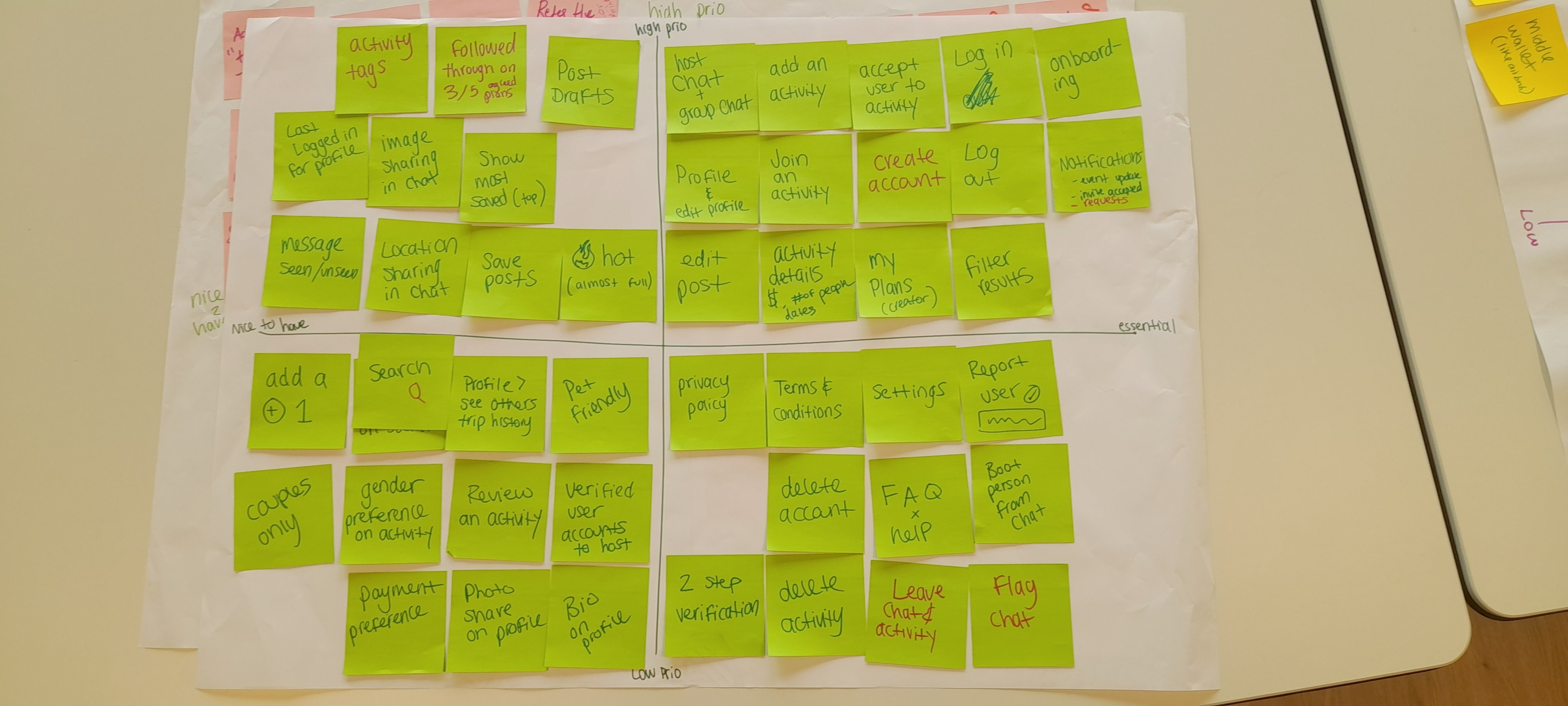
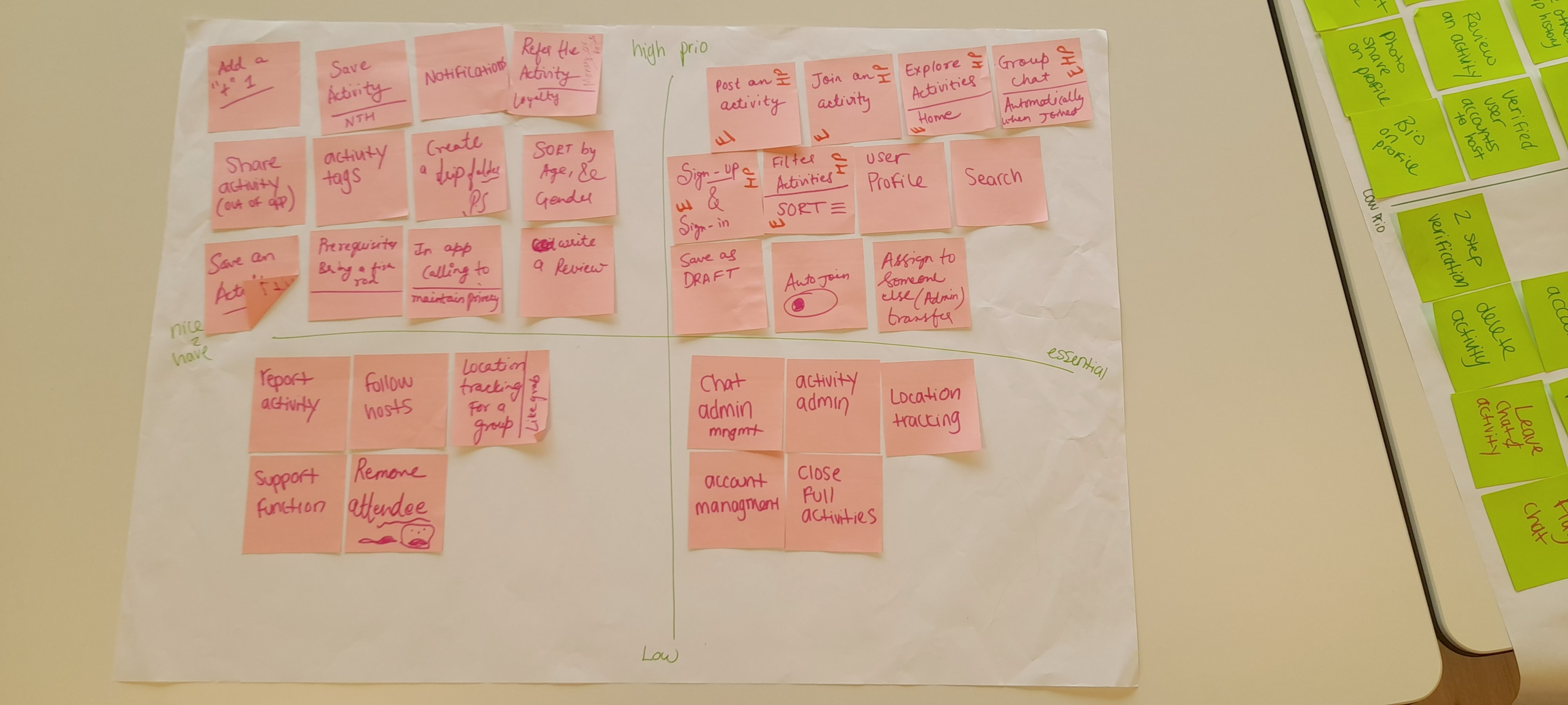
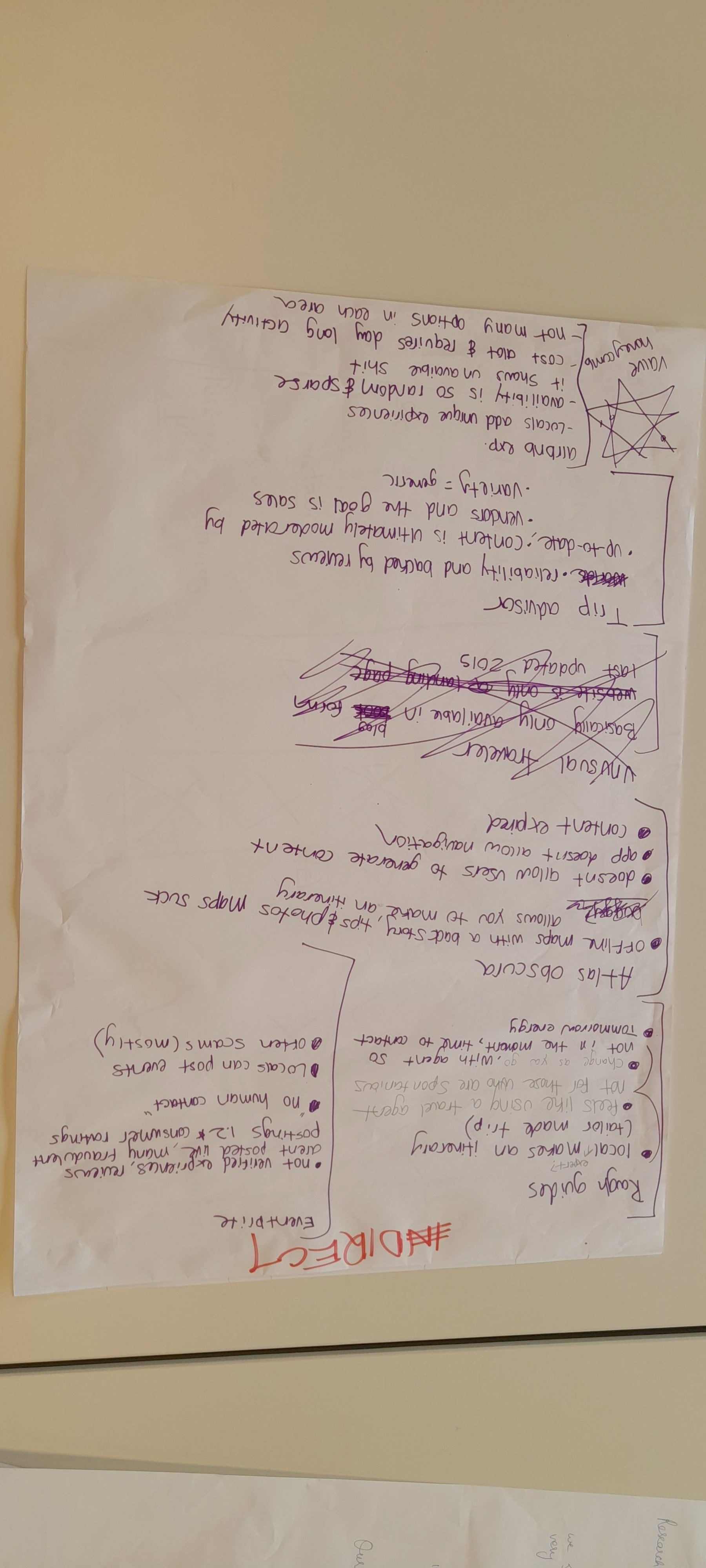
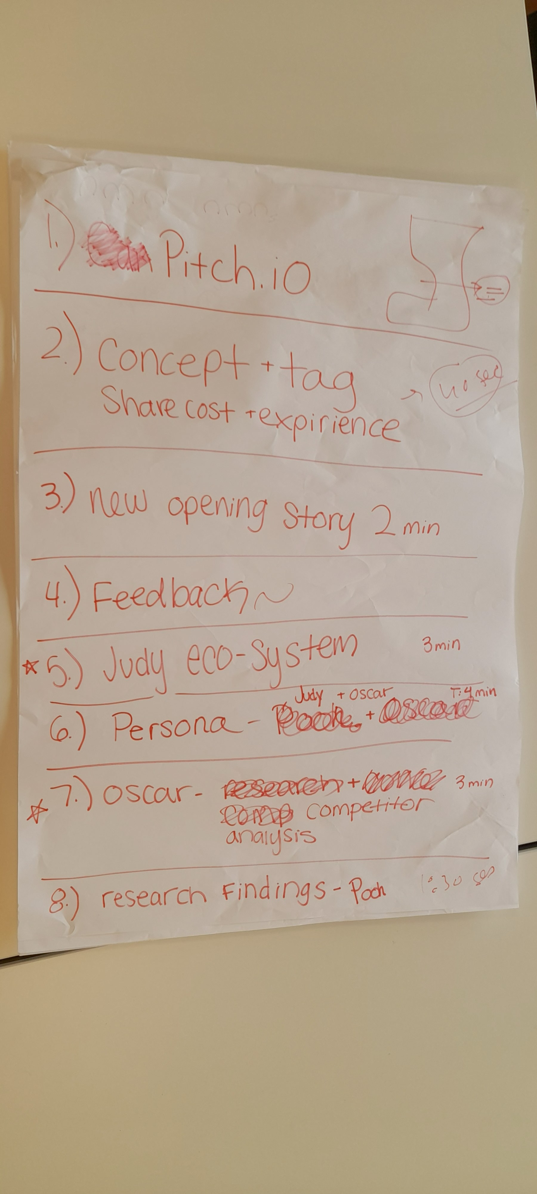
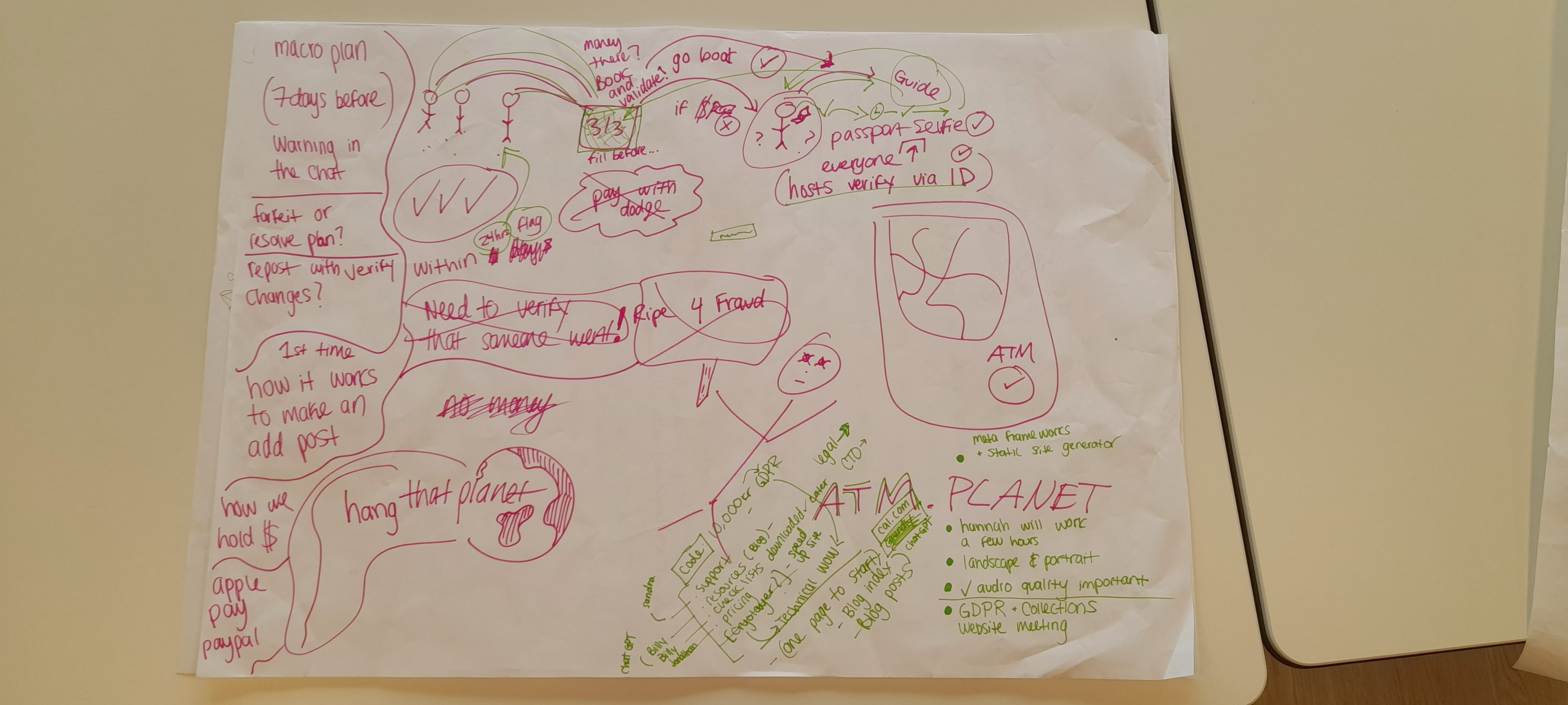
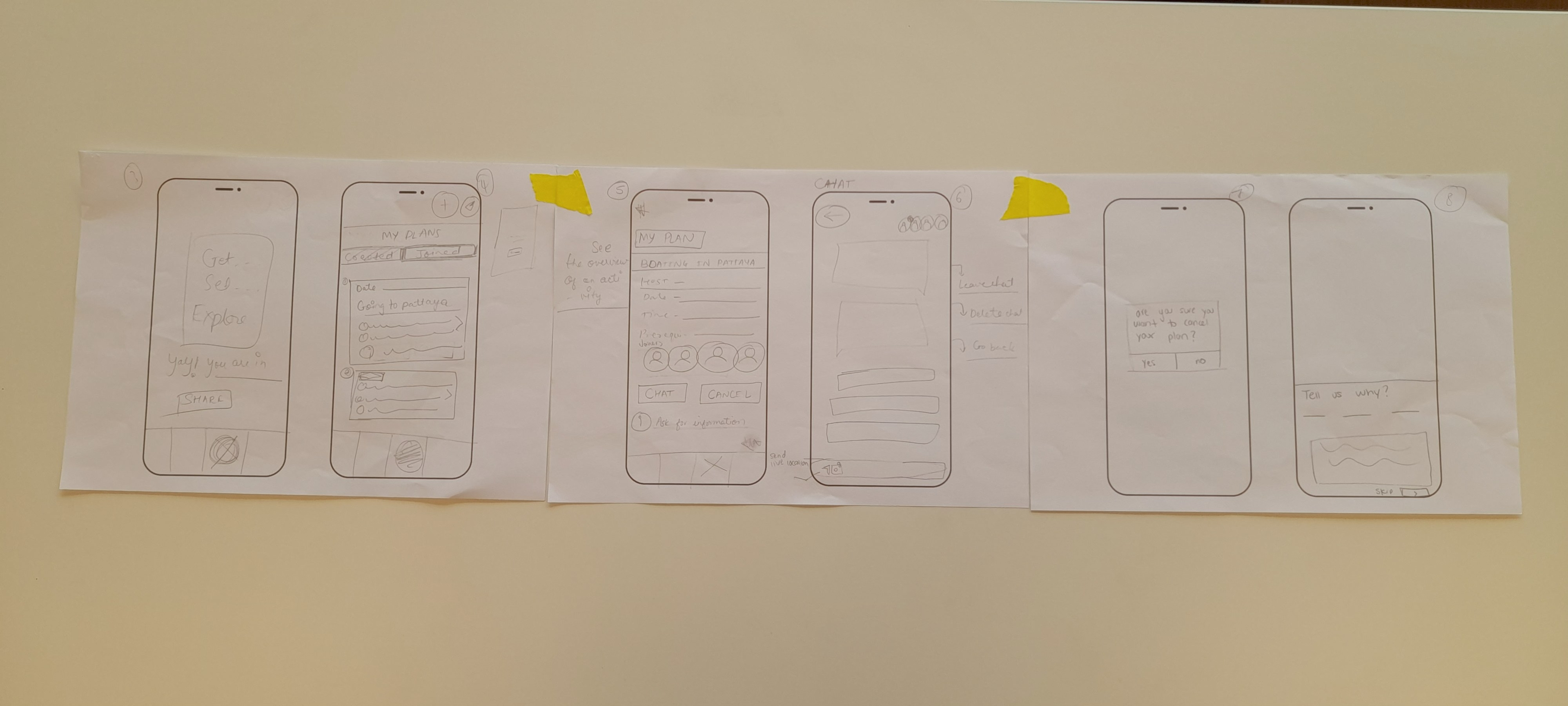
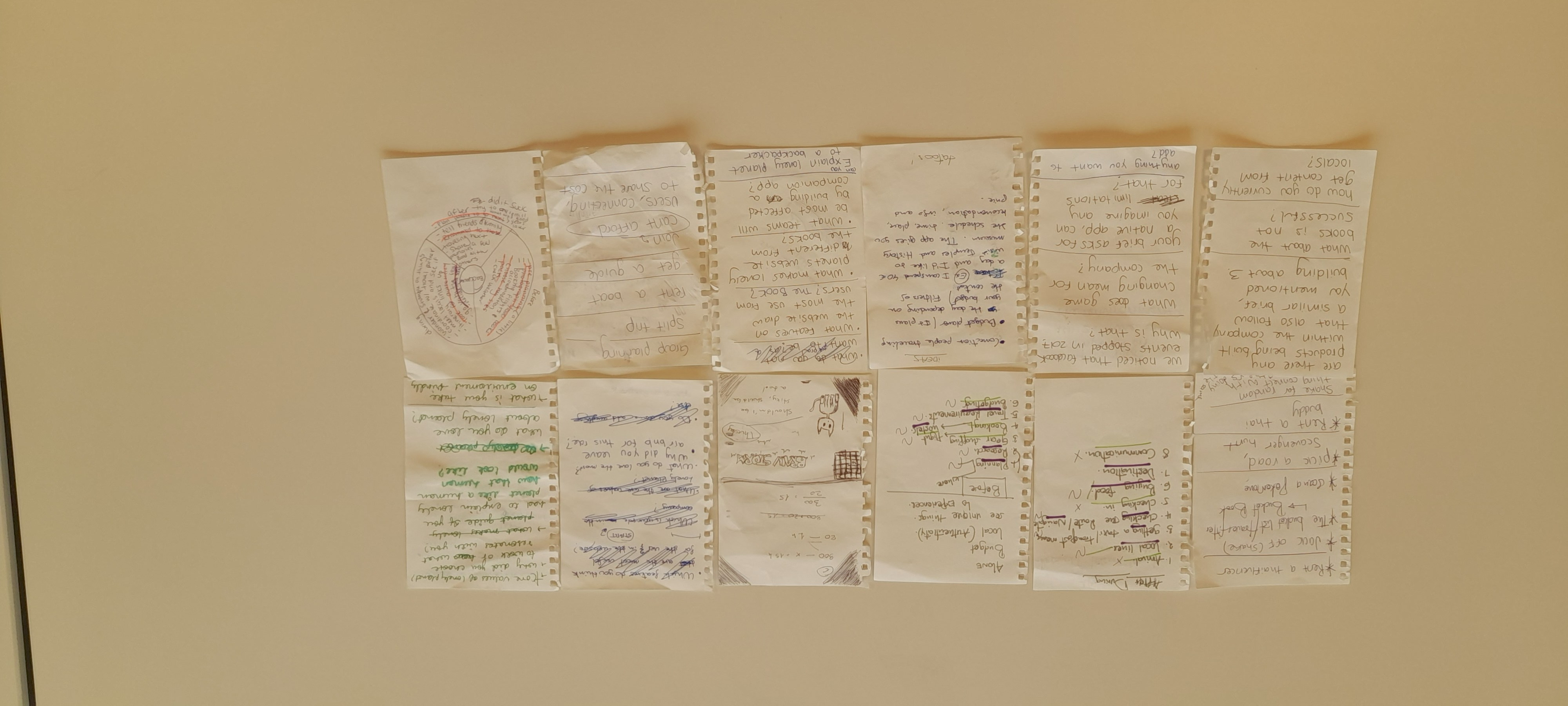
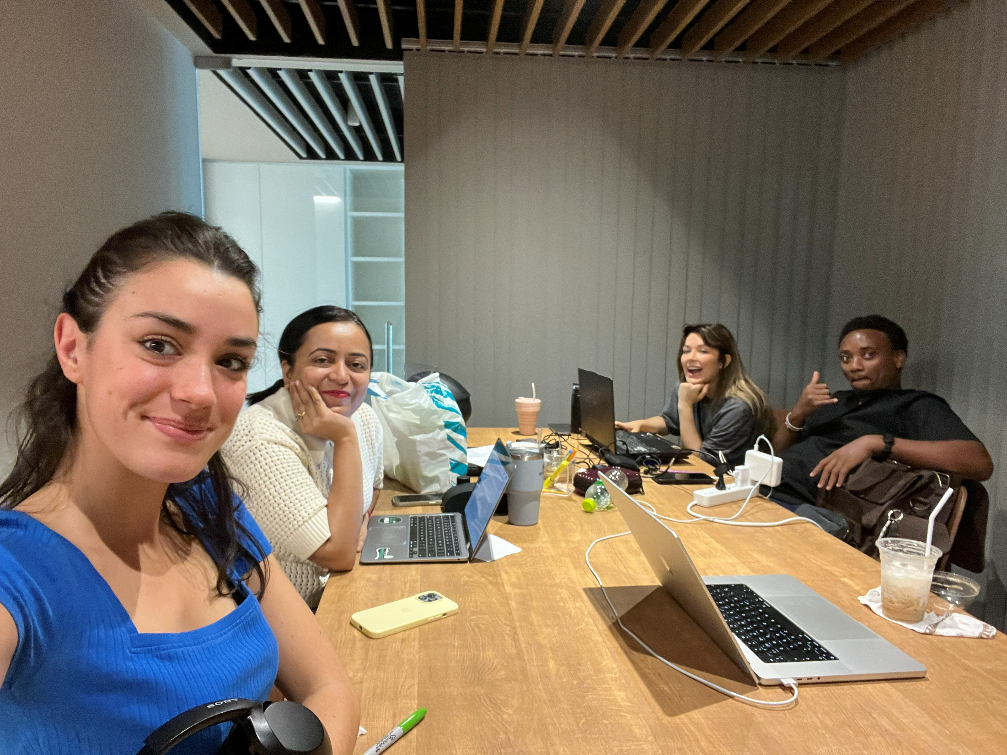
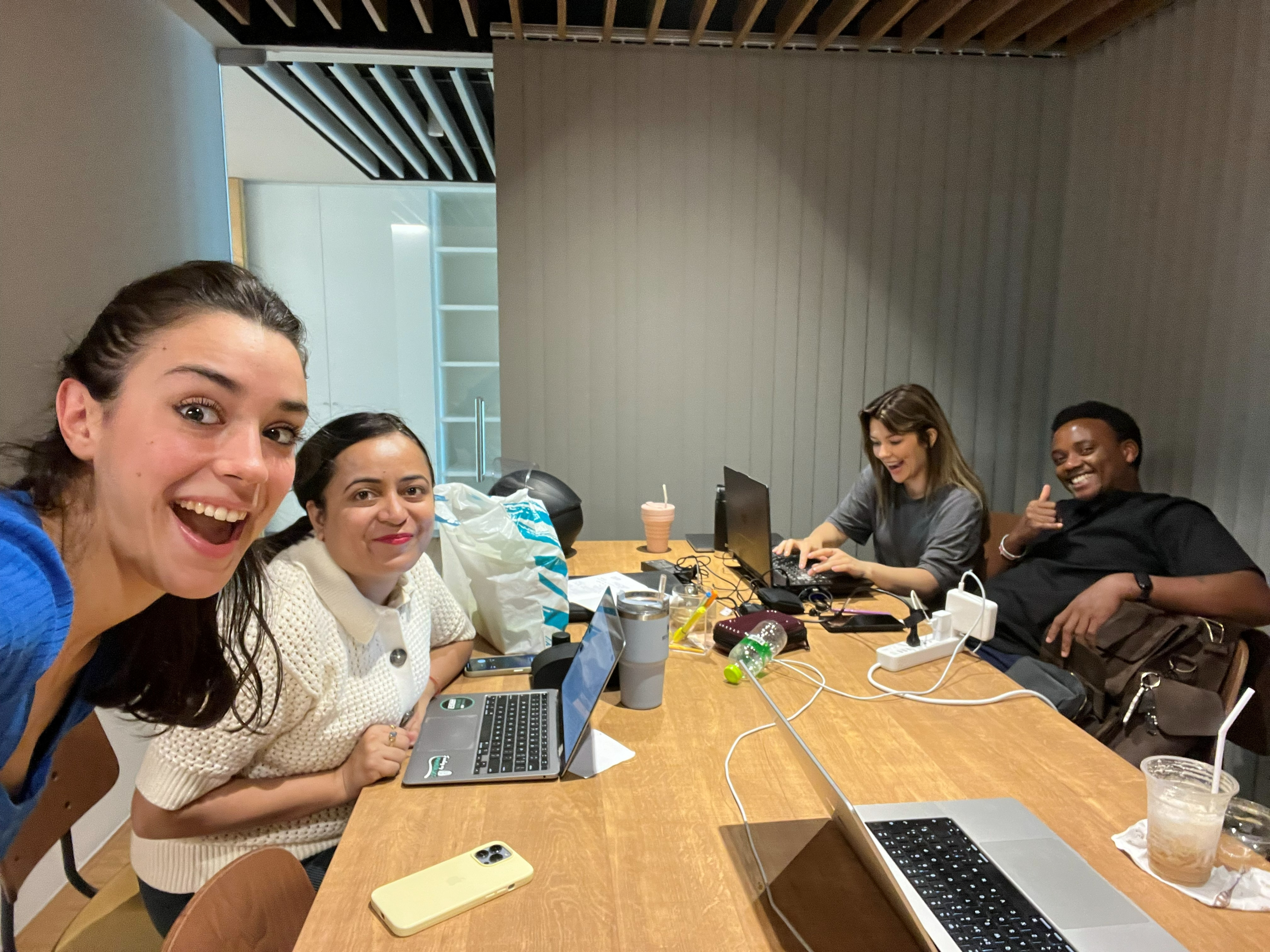
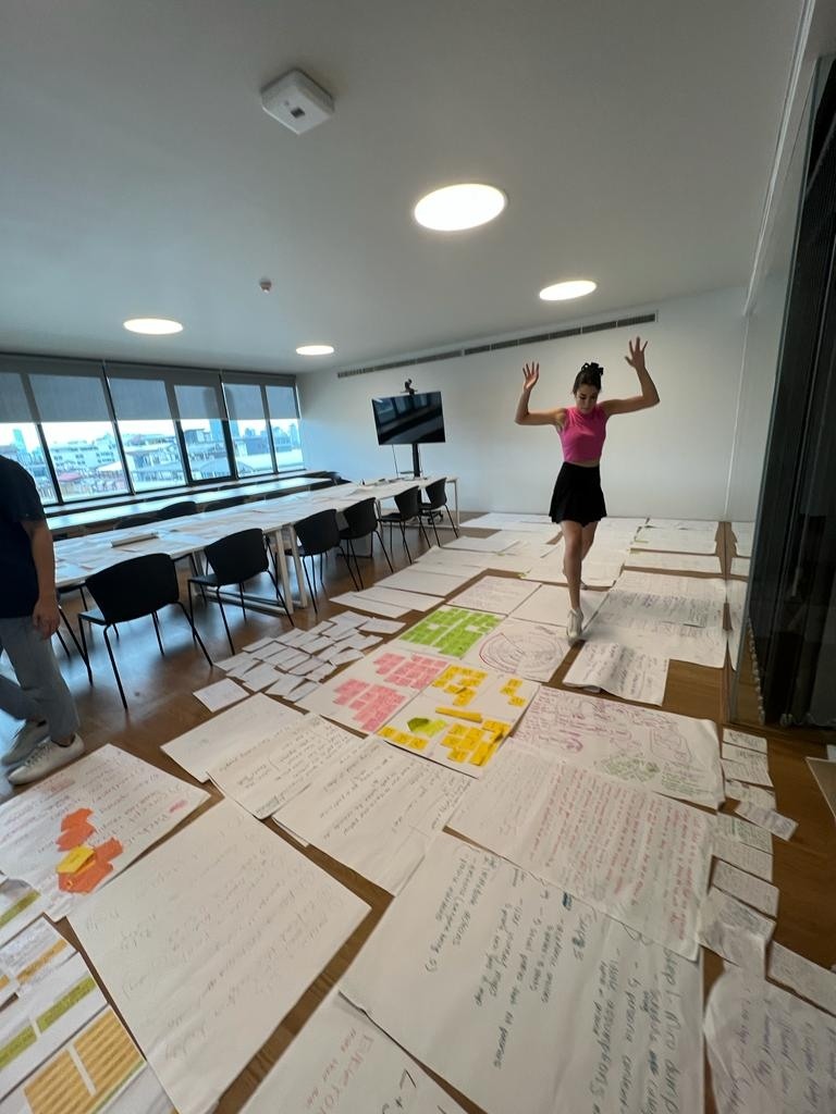

The research didn't start in Figma.
Before a single wireframe existed, this project began with 100 strangers, a notebook, and a lot of nervous small talk on Khaosan Road. I wrote about what that process actually taught me about designing for people I'd never met, the full story is on The Human Interface.
Read Blog Post