Members
Lily
Poornima
Judit
Tools
Role
Lonely Planet was looking for the ultimate native app designed to be a digital companion piece to Lonely Planet books, apps, and website. The app must seamlessly integrate into the ecosystem, offering creative and user-centric features for both "The Backpacker" and the "Well-Traveled Adventurer" Gen Z audiences. From pre-travel planning, during the journey, to post-travel sharing, the app must facilitate finding accommodation, restaurants, and local sites and fostering connections among users.
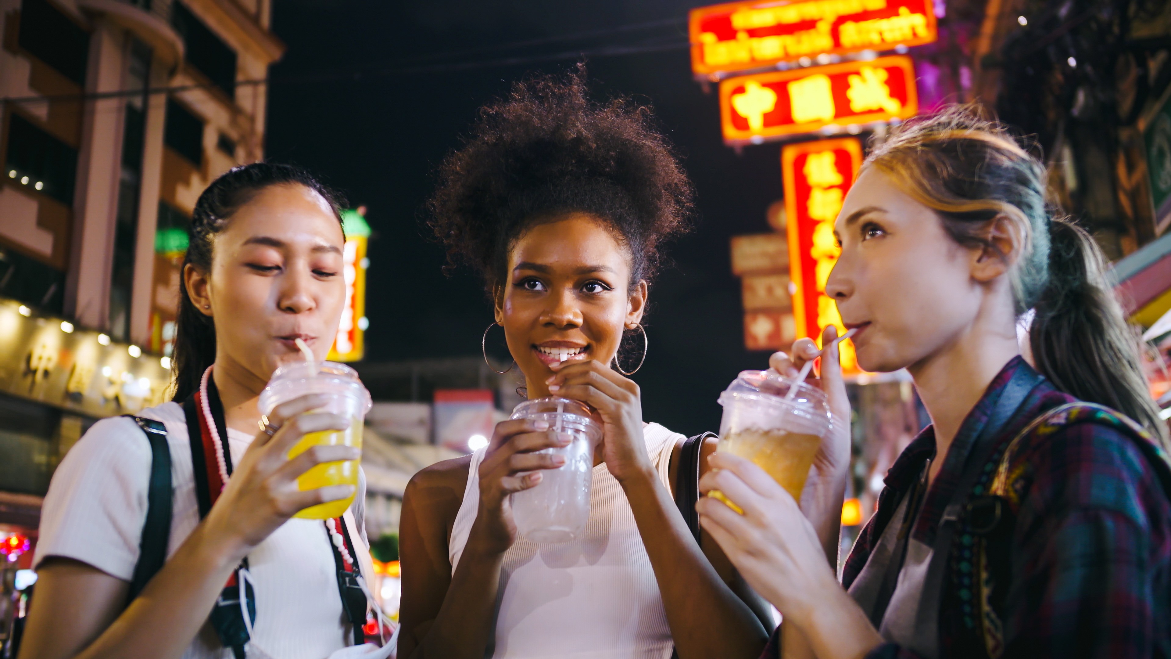
our team embarked on an extensive research journey to understand the needs and aspirations of our target audiences. We each interviewed 25 travelers. We went to backpacker hostels within Khaosan Road, Bangkok, Thailand, and strategically timed our interactions with backpackers, catching them before they embarked on their adventures in pursuit of affordable dining and vibrant nightlife activities. This approach ensured their receptiveness to our inquiries, free from distractions and fully engaged them.
Moreover, we sought out hostel-friendly restaurants with communal seating, where we engaged in meaningful conversations with travelers, creating a relaxed atmosphere that encouraged open dialogue. This enabled us to enrich our understanding of their unique needs and pain points, grasping the essence of their wanderlust.
We gained valuable insights into the preferences of backpackers and well-traveled adventurers. During brainstorming sessions, we explored various concepts that aligned perfectly with Lonely Planet's brand essence, ensuring our design resonates with their needs.


Sorted insights in cards based on similar themes
We organized the interview results, sorting them based on common motivations, preferences, and travel styles. This approach allowed us to identify patterns and key insights, of the users' needs during each phase oftheir travel.

We developed 4 personas based from the card sorting
Each card represented a unique archetype of travelers, encompassing their motivations, preferences, and travel styles. This led us to develop personas. They enabled us to empathize with, and better understand the diversity of user groups.
Sorority Stella
Stella is traveling with her friends. She parties in groups of four to six, ensuring affordability and safety. Traveling with friends lets her share expenses, making the trip budget-friendly. In a group, she can enjoy security and camaraderie, creating a
win-win situation for all!
Khaosan Kevin
Kevin is a travel enthusiast who loves visiting new cities. However, he has a particular preference for tourist spots. He believes that these spots define a city's essence, and that leaving them feels unfamiliar and inconvenient.


Penny Jenny
Jenny is low on funds, but she's determined to make the most of her final trip days. She's been saving up for this trip for years, and she doesn't want to let anything get in the way of her having a great time.
Worry Wong
Wong is a solo traveler who has been partying too much lately and is starting to feel the financial effects of her partying, and needs to cut back on her expenses. She has decided to seek out affordable experiences with others.

Main persona Sorority Stella
Sorority Stella
Stella is travelling with a few friends, partying together with other groups of four-six backpackers. They are also on a budget and would really love to split the cost of their activities, from accommodation to food and travel expenses as well. Being a girl, abroad, this will help Stella meet her need for safety
The concept: Trip Split
We had brainstorming sessions to develop the concept. They provided a platform for us to unleash our creativity and generate numerous ideas. Eventually, we created Trip Split, an application where like-minded travelers can create, plan, join, and Share the Costs of activities.

Competitor analysis
The competitor analysis uncovered valuable insights, including unique selling points, market trends, and performance benchmarks. These insights encompassed factors such as the ease of finding activities, connecting with like-minded travelers, cost-sharing capabilities, activity planning options, and seamless chatting features.

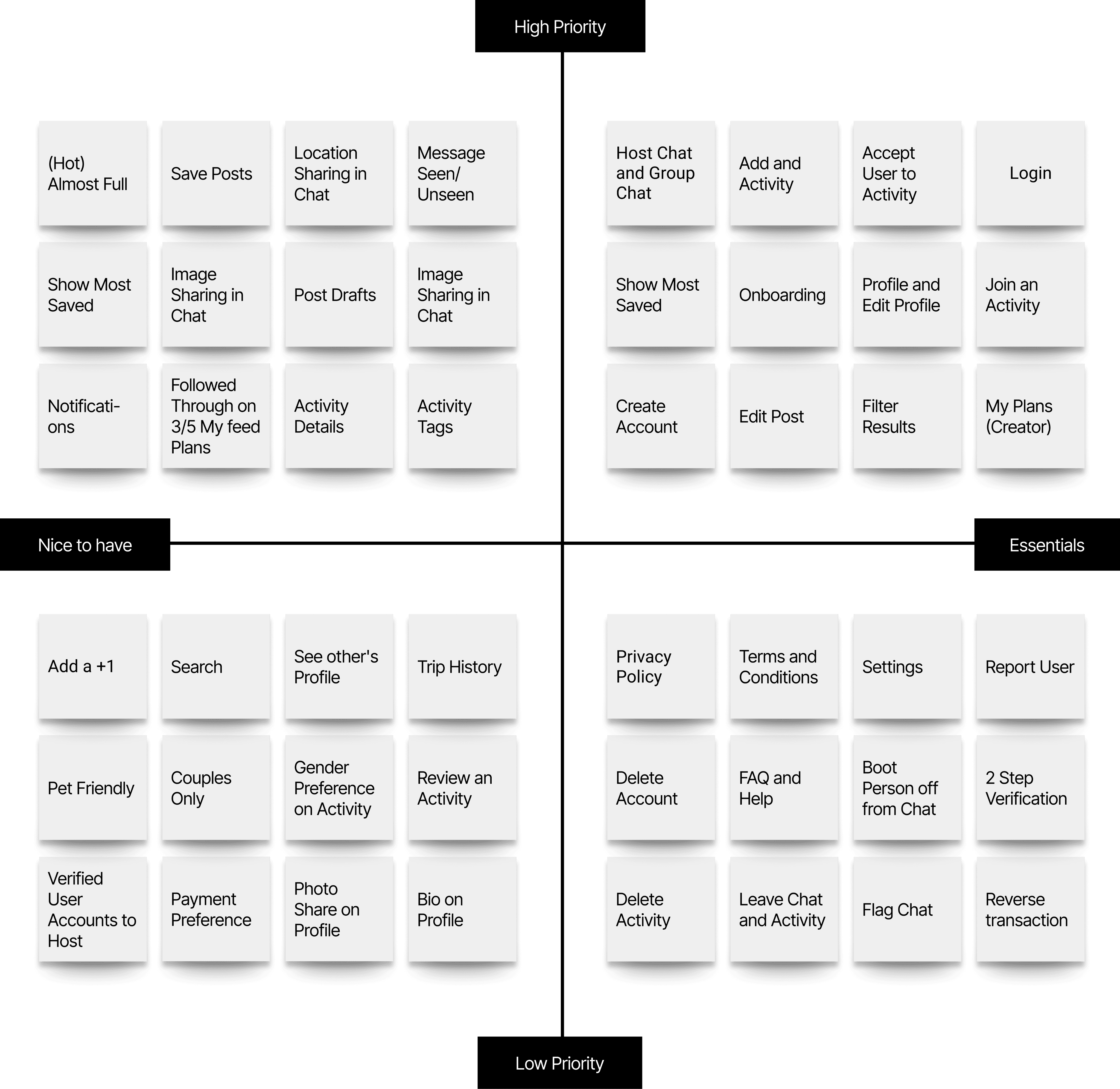
MVP map to validate Trip Split's core functionalities
In the Trip Split app's MVP, we included user registration and profile creation, trip planning and organization, accommodation and restaurant recommendations, social networking and travel community, cost splitting and budget management, offline access and trip documentation, and seamless integration with third-party services. This carefully curated set of features allowed us to validate our product's core functionalities and value proposition, providing users with a delightful and purposeful travel experience.
Sitemap to visually organize the content and structure
Lonely Planet was looking for the ultimate native app designed to be a digital companion piece to Lonely Planet books, apps, and website. The app must seamlessly integrate into the ecosystem, offering creative and user-centric features for both "The Backpacker" and the "Well-Traveled Adventurer" Gen Z audiences. From pre-travel planning, during the journey, to post-travel sharing, the app must facilitate finding accommodation, restaurants, and local sites and fostering connections among users.

User flows to visualize the journey our users would use to plan and split the cost
The user flow was very important for us to understand the user experience design, allowing us to analyze the logical flow of interactions, identify pain points, and enhance usability. They enabled task analysis, error prevention, and effective communication among the stakeholders.

Wireframes to visualize the layout and basic Trip Split app functionalities
From the user flows, the wireframes were essential in mapping out the logical progression of the user's interactions with the Trip Split. They visually depicted the sequence of screens and interactions users would encounter, ensuring a smooth and intuitive user experience.


High fidelity wireframes
They made sure that the design is user-friendly and meets the needs of our users. They gave users a realistic preview of the final product, so that we could get their feedback on the look, feel, and functionality of the design. We also needed to make sure that the developers would understand the design implement it correctly.

My key takeaways
I now understand it's important to embrace a user-centric approach, conduct user research, and iterate designs based on feedback. Collaboration, effective communication, and data-informed
decision-making is crucial. Design thinking, visual design, user flows, and information architecture skills are essential.
In closing, the lessons gleaned from this experience extend far beyond design principles. They encapsulate a commitment to empathy, collaboration, and the belief that great design can change lives. I am eager to witness the ripple effect Trip Split will have on the backpacking community and am filled with anticipation for the journeys that await. May we all find inspiration in the stories we share and the adventures yet to come.
©2023 designsbykamau